

Design comparison
SolutionDesign

Solution retrospective
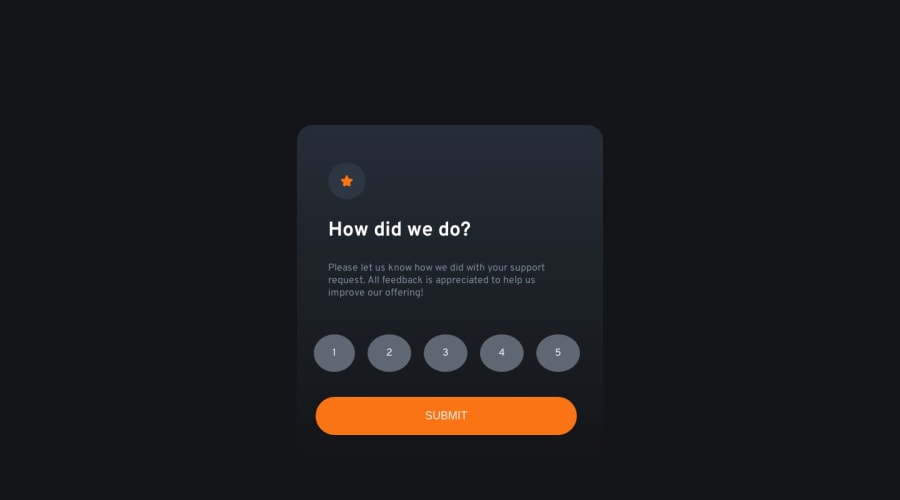
My solution to the Interactive-rating-component challenge, we purposely left the main containers uncentered for design purposes, let me know how you guys think I did.
Community feedback
- P@FacundoDLRPosted 2 months ago
Hi @UbaidRussell,
I was looking at your solution and I would like to leave you some suggestions that I hope will be helpful to you.
- use relative and NOT absolute measurements for container/item sizes (unless you want it to be a fixed measurement and not affect the behavior of the other elements).
- the use of margin is recommended for external spacing and relationships between elements, in this case it seems to me that it is not necessary since you can use other properties such as padding, text-align, flex, among others.
- In general, it is always recommended to reset the CSS styles at the beginning of this since this way we avoid strange behaviors depending on the browser used, a simple code that can be used at the beginning of your CSS is the following:
* {
  margin: 0;
  padding: 0;
  box-sizing: border-box;
}
but you can investigate other alternatives that better suit your project.
- Finally, a suggestion for the UI of your design would be regarding the colors of the buttons, you could add a base color, a color for the selection and another for the :focus and :active states.
I hope these suggestions are of some use to you and congratulations on your solution. 😊
0

Please log in to post a comment
Log in with GitHubJoin our Discord community
Join thousands of Frontend Mentor community members taking the challenges, sharing resources, helping each other, and chatting about all things front-end!
Join our Discord