Design comparison
SolutionDesign
Solution retrospective
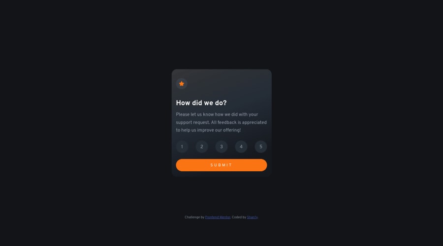
Feedback is welcomed. Realizing now that I should have added error handling i.e. clicking the "submit" button before choosing a rating, but I'll keep that in mind for next time. The most difficult part might have been trying to match the gradient background to the design haha.
Didn't know the use of list elements was going to be an issue, but I'll look out for that next time.
Community feedback
Please log in to post a comment
Log in with GitHubJoin our Discord community
Join thousands of Frontend Mentor community members taking the challenges, sharing resources, helping each other, and chatting about all things front-end!
Join our Discord
