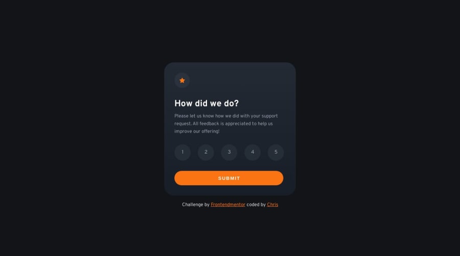
Design comparison
SolutionDesign
Solution retrospective
Hey guys
what do you think about my solution ? feedback would be highly appreciated!
Community feedback
- @0xabdulkhaliqPosted over 1 year ago
Hello there 👋. Congratulations on successfully completing the challenge! 🎉
- I have other recommendations regarding your code that I believe will be of great interest to you.
BODY MEASUREMENTS 📐:
- Use
min-height: 100vhforbodyinstead ofheight: 800px. Setting theheight: 800pxmay result in the component being cut off on smaller screens.
- For example; if we set
height: 800pxthen thebodywill have800pxheight no matter what. Even if the content spans more than800pxof component.
- But if we set
min-height: 100vhthen thebodywill start at100vh, if the content pushes thebodybeyond100vhit will continue growing. However if you have content that takes less than100vhit will still take100vhin space.
.
I hope you find this helpful 😄 Above all, the solution you submitted is great !
Happy coding!
Marked as helpful1 - @lack21Posted over 1 year ago
Good Work! 👍
I recommend you to replace 'background-color: var(--dark-blue)' from Class "card" and add something like 'background-image: radial-gradient(circle at top, hsl(213, 19%, 18%), hsl(214, 31%, 11%))', it's going to make background look better.
1
Please log in to post a comment
Log in with GitHubJoin our Discord community
Join thousands of Frontend Mentor community members taking the challenges, sharing resources, helping each other, and chatting about all things front-end!
Join our Discord
