interactive-pricing-component-main
Design comparison
Community feedback
- @victorJandreuPosted 12 months ago
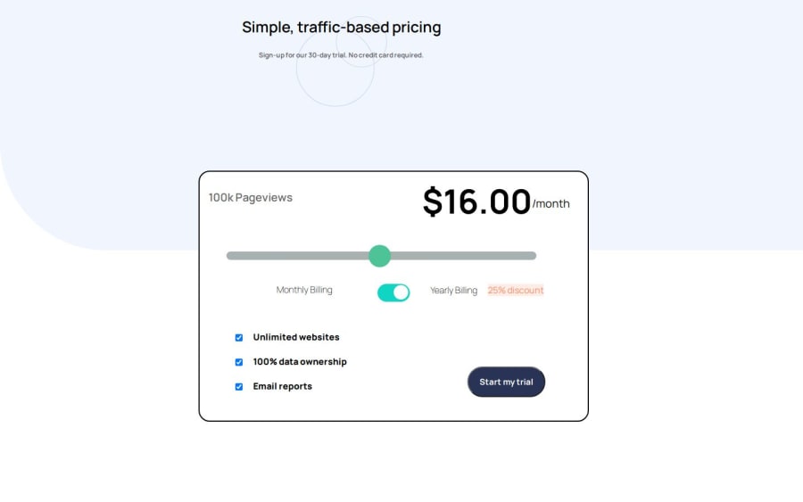
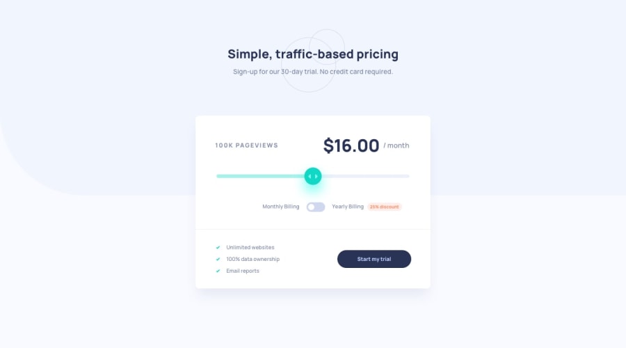
hey! I see that your range button is quite different that the desing. I did it yesterday and what a nightmare to understand how to do it XD.
I recommend you to read this two article and check my code in my solutions :)
this is good to understand why we need to do to change the style of this special type of input
https://www.smashingmagazine.com/2021/12/create-custom-range-input-consistent-browsers/
This is important to create a bar that do the progress
https://maame.hashnode.dev/custom-input-range-slider
thank to this two article I could do something like this
https://victorjandreu.github.io/radio-btn/
here is the repository of the example I send you right know, everything is very weel explaining in commeraty in the repository, but they are in spanish which is my mother language :S
https://github.com/victorJandreu/radio-btn
But if you want the example on this input same at the desing check my answer to this project :)
Marked as helpful1@Onyekachi10Posted 12 months agothank you, Victor I will update it. it was really a nightmare @victorJandreu
0
Please log in to post a comment
Log in with GitHubJoin our Discord community
Join thousands of Frontend Mentor community members taking the challenges, sharing resources, helping each other, and chatting about all things front-end!
Join our Discord

