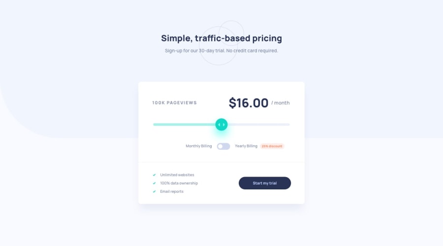
Design comparison
Solution retrospective
Hello community,
I hope you're all doing well. While working on this project, I've come across a couple of challenges that I'd appreciate some help with.
- Icon Slider Alignment:
In my App.jsx, I've been struggling with aligning the icon-slider in the center of the range-slider-thumb. The related code section is currently commented out in my App.jsx, as shown below:
<div className="relative w-full mb-12 flex justify-center md:order-3 mt-10">
  <input
    type="range"
    min="0"
    max="100"
    step="25"
    value={sliderValue}
    onChange={(e) => setSliderValue(e.target.value)}
    className="range-slider"
    style={{ background: sliderGradient }}
  />

  {/* <img
    src={iconSlider}
    alt="icon-slider"
    className="absolute -top-0.5 -translate-x-1/2"
    style={{
      left: `${sliderValue}%`,
      transform: `translate(${sliderValue === 0 ? '50%' :
        sliderValue === 25 ? '0%' :
        sliderValue === 50 ? '-50%' :
        sliderValue === 75 ? '-100%' :
        sliderValue === 100 ? '-150%' :
        '0'
      })`,
    }}
  /> */}
</div>
I've tried a few techniques, but I couldn't achieve the desired alignment. If anyone has insights or suggestions on how to achieve this, I'd be really grateful.
- Responsive Design and Chrome Dev Tools:
While I've implemented responsive design in my site, I've noticed an issue when using Chrome Dev Tools to simulate specific devices like the iPhone XR and Samsung Galaxy.
The content gets clipped, and scrolling doesn't work as expected. I've experimented with the overflow property, but haven't found a solution yet. I'm wondering what I did wrong. I would appreciate it if anyone can help me out with this.
Any help or guidance you can provide on these two challenges would be greatly appreciated. Thank you in advance for your assistance!
Best regards, Koya
Community feedback
Please log in to post a comment
Log in with GitHubJoin our Discord community
Join thousands of Frontend Mentor community members taking the challenges, sharing resources, helping each other, and chatting about all things front-end!
Join our Discord
