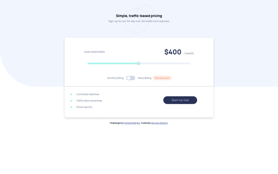
Design comparison
Solution retrospective
this project was really fun i tell you, but it would have been better if we where not given the pageview to target a price it would had been better if we just had to write the function to solve for it, thanks for this project . LOVE 7milkyways.
Community feedback
- @darshii98Posted over 3 years ago
The slider component is not smooth. 8, 12, 16 are showing in the beginning and 36 at the end. Maybe you should think about implementing a uniform step size. Also below 400px screen width, the toggle switch appears to be very small, and the toggle effect isn't effective, try to maybe put a min-width on the toggle. Everything else looks great. Happy Coding!
Marked as helpful0@iamdestinychildPosted over 3 years ago@darshii98 hey thanks for your reply the slider component was what the challenge asked for and i tried making smooth that is use math to solve for it rather than targeting it with some if statements but am going to fix it all up right now thanks for your review. do check back later
0@iamdestinychildPosted over 3 years ago@darshii98 hey i pushed the project again kindly check it out and give me your response
0@darshii98Posted over 3 years ago@devclones1 Hey, it looks great now ; ), one small issue, the background image is not covering the entire width of the window, maybe try to provide some proper position to it!!
0@iamdestinychildPosted over 3 years ago@darshii98 on what screen size is that cause on mine it is looking fine
0 - @iamdestinychildPosted over 3 years ago
thanks bro but i think am going to stop here and try out other projects
0
Please log in to post a comment
Log in with GitHubJoin our Discord community
Join thousands of Frontend Mentor community members taking the challenges, sharing resources, helping each other, and chatting about all things front-end!
Join our Discord
