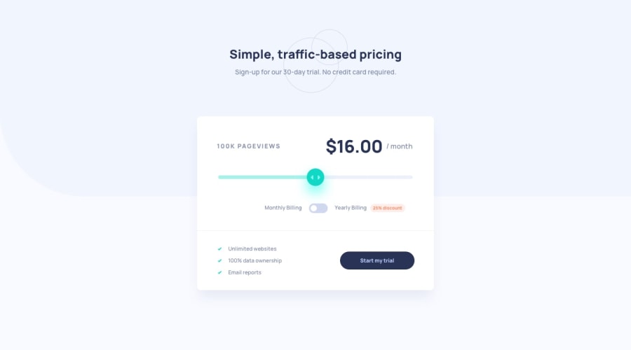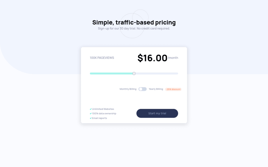
Design comparison
Solution retrospective
Hey! This is my first ever solution to a challenge on this website, I thoroughly enjoyed coding this. Hope to keep learning more!☺
I would truly appreciate some feedback but, I must warn you. My code isn't the most prettiest code you'll come across. It's super inefficient and, You may lose brain cells trying to understand it. If you do decide to go through my code regardless and give me feedback... I RESPECT you!
Community feedback
- @dwhensonPosted over 3 years ago
Hey @buneeIsSlo good work on your first challenge! 🙌 And not an easy one at that! I found this one very fiddly and it took me a while to sort things out.
I wanted to give you some feedback as I know I felt quite nervous about submitting my first few challenges - and still do! Heres some comments for you to consider:
-
A few HTML/CSS things - firstly, great use on semantic HTML elements for the toggle and input. I think the relative positioning on your
section.toggle
is forcing the whole section over, and it should ideally be centered. Adding somemargin-left
andmargin-right
with the valueauto
should fix this. -
Regarding the input the colored bar is not updating when the slider moves, and I'm afraid the figures/plans get all confused when I try changing things, and the slider isn't really working properly.
There may be better solutions, but to create a custom scale I created an array in my JS like this:
const plans = [ { views: "10K", price: 8, discount: 6 }, { views: "50K", price: 12, discount: 9 }, { views: "100K", price: 16, discount: 12 }, { views: "500K", price: 24, discount: 18 }, { views: "1M", price: 36, discount: 27 }, ]
Then used the input attributes to set the number of steps to the length of the array using something like this: min="0", max="4", step="1" on the input. This enabled my to step up the values in line with the requirements. This then provided the basis for all the JS functionality.
I feel like I've explained this poorly, but if you have a Google you'll find some good examples. It's a lovely elegant solution when you see it working well. My solution may also help a little: https://github.com/dwhenson/frontend-mentor/tree/master/22.%20interactive-pricing-component
- Lastly, on CSS I couldn't see any outline or tab styles when I tab through the document, this is a small point but makes the page much more usable. I just add something like this to all my projects which goes a long way to fixing this:
:focus-visible { outline: 3px dotted currentColor; outline-offset: 0.25rem; } :focus:not(:focus-visible) { outline: transparent; }
Please just give me a shout here or on Slack if any of the points above are not clearly explained. I've done a few of these challenges now and have really seen myself improve over the last few months so I would encourage you to keep up the good work!! 👍
Cheers 👋
2 -
- @buneeIsSloPosted over 3 years ago
Hey! @dwhenson, Thank you for taking the time out of your day to respond to me. I extremely appreciate your valuable feedback.
About the
section.toggle
...Ya, I don't know what was going through my thick skull, Setting the margins left and right toauto
would've made the code much less complex and the responsiveness much more clean. Will keep this in mind for the future.Regarding the slider not updating the background colour when moved, I think the reason behind this is the mouse event
"mousemove"
that I decided to use. The input background only changes when the cursor isn't hovering over the slider itself, I think this is what's causing the inconsistencies.... I may be wrong though.I've been spending time going through everyone else's solutions, Once I find a solution that I can comprehend completely, I'll make sure to update mine.
Thank you once again for this very informative feedback. And don't sell your self short, You did a GREAT at job at explaining this to me. Happy Coding! :)
1@dwhensonPosted over 3 years ago@buneeIsSlo sounds like you’ve got a good way forward here.
Yeah, I think you’ve got the wrong event type there. I was using my keyboard for example! Perhaps ‘change’?
This is a really fiddly challenge to start with though so great work on seeing it though.
Look forward to seeing your next one!!
1
Please log in to post a comment
Log in with GitHubJoin our Discord community
Join thousands of Frontend Mentor community members taking the challenges, sharing resources, helping each other, and chatting about all things front-end!
Join our Discord