Interactive-comments-section-main
Design comparison
Solution retrospective
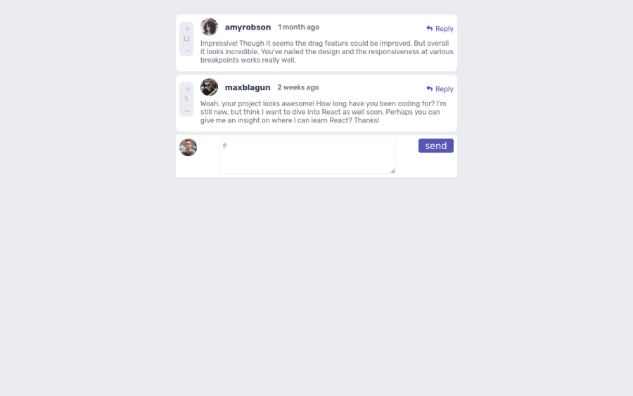
This is my first react project is still under development as i continue to learn, but I have shared it now for code advise
Please log in to post a comment
Log in with GitHubCommunity feedback
- P@visualdenniss
Congrats on completing the challenge successfully! Looks great and seems to be responsive as well.
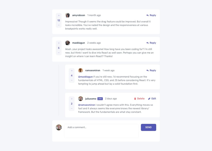
However i have few suggestions related to user experience: It looks like when clicking on maxblagun two replies are suddenly displayed, but i've clicked it on the maxblagun by accident, in fact, there was nothing indicating that it is clickable. So perhaps a cursor:pointer or a hover state could be useful to indicate. Also when i click on reply, somehow two input fields are opened with two send buttons, which made me confused. So you might consider working on that further.
Hope you find this feedback helpful!
Marked as helpful
Join our Discord community
Join thousands of Frontend Mentor community members taking the challenges, sharing resources, helping each other, and chatting about all things front-end!
Join our Discord
