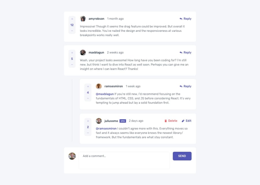
Design comparison
Solution retrospective
Could definitely have used Context API instead of all this different state calls and passing props on and on (will prob try to implement it later). I could not save replies to localstorage, only top level comments, probably because of the state being managed in different places. Again, this one was pretty hard for me, considering my lack of experience, but I accepted the challenge with open arms as a way to learn through hard practicing. I believe I've missed the 'main' and 'h1' tags for a better semantic feature too.
Community feedback
- @shashreesamuelPosted over 2 years ago
Hey good job completing this challenge, keep up the good work
Your solution looks great however I think that your box-shadow is supposed to be subtle.
In terms of your accessibility issues
-
buttons must have text, simply mention the
aria-labelvalue and give a text for the button -
Wrap all your content between
maintags to get rid of the rest of accessibility issues.
I hope this helps
Cheers Happy coding 👍
Marked as helpful0 -
Please log in to post a comment
Log in with GitHubJoin our Discord community
Join thousands of Frontend Mentor community members taking the challenges, sharing resources, helping each other, and chatting about all things front-end!
Join our Discord
