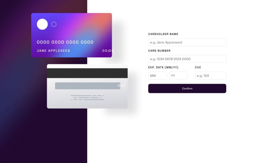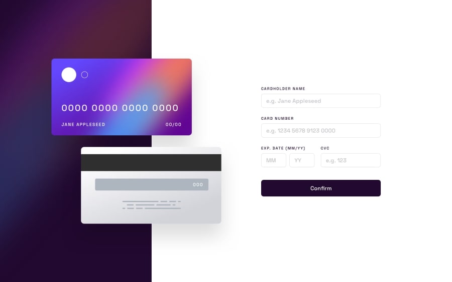
Design comparison
SolutionDesign
Solution retrospective
Hey , this was my first time using sass , and I think I was okay-ish , as far as user form validation is considered , it is okay-ish as well , cant do anyhting about transparent borders as it looks ugly otherwise , I didn't put any message when any form field was empty ,rather I highlighted the borders , was too tired at that point , revised CSS many times for the best approach to the design , due to which missed out on responsiveness at medium viewports . . . feel free to help **cheers !!!**🥂
Community feedback
Please log in to post a comment
Log in with GitHubJoin our Discord community
Join thousands of Frontend Mentor community members taking the challenges, sharing resources, helping each other, and chatting about all things front-end!
Join our Discord
