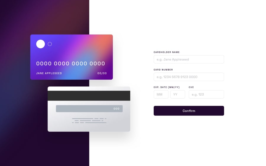
Design comparison
SolutionDesign
Community feedback
- @AdelinkedPosted about 2 years ago
I saw your preview site and I liked a lot the work you’ve done here and I’ve some suggestions you can consider applying to your solution :
- For the desktop design it would be better if the user can see all the form at once without the need for scrolling down as there is enough space horizontally to put the card images at the left of the form and not above it.
- Make sure to reset the form with the initial values ("JANE APPLESEED","0000 ...",....) when the user clicks "Continue" on the completed state.
- When the user corrects any error make sure that this error message disappears and it's also cleared when the user clicks "Continue" on the completed state.
Marked as helpful1@PivtoranisVPosted about 2 years ago@Adelinked Thank you, will try to change that
1
Please log in to post a comment
Log in with GitHubJoin our Discord community
Join thousands of Frontend Mentor community members taking the challenges, sharing resources, helping each other, and chatting about all things front-end!
Join our Discord
