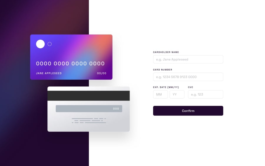
Design comparison
SolutionDesign
Solution retrospective
I was enjoying building the project, and I'm now struggling with how to organize my code and how to reduce CSS lines.
Community feedback
- @Mann-webspiderPosted over 1 year ago
the input field is a bit odd from my prespective you can try playing with padding for input field you can customise it too
0
Please log in to post a comment
Log in with GitHubJoin our Discord community
Join thousands of Frontend Mentor community members taking the challenges, sharing resources, helping each other, and chatting about all things front-end!
Join our Discord
