


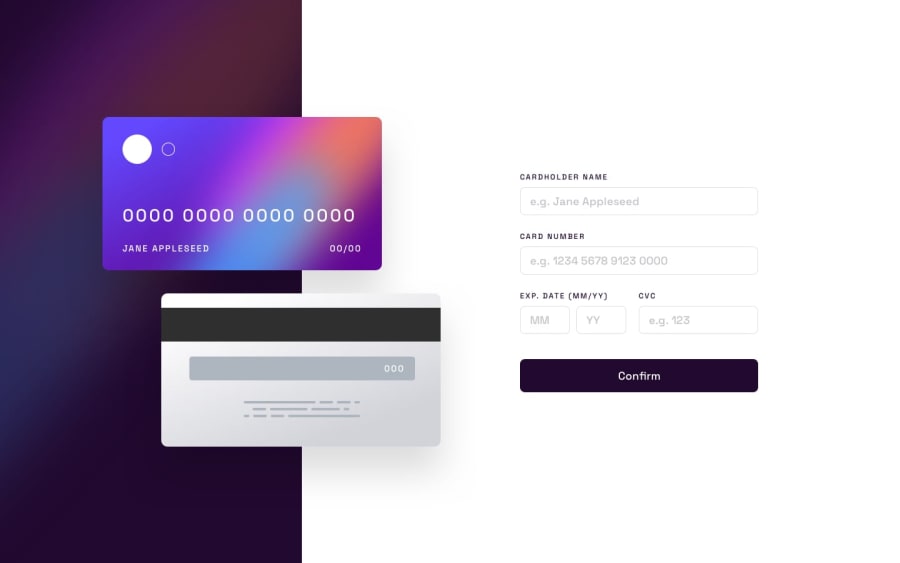
Design comparison
Please log in to post a comment
Log in with GitHubCommunity feedback
- @VickyAzola
Hi there! Good work on completing this challenge! I checked your solution and noticed that when the window is large, the content escapes the card.
To fix this you can create a container div with a background image of the card and place the content of the card inside. Something like this:
  <div class="card-container">
    <div class="card-back">
      <p id="cardCVC" class="absolute right-16 text-white"> OOO </p>
    </div>
    <div class="card-front">
      <div class="absolute top-5 left-8 bg-white h-[29%] w-[15%] rounded-full text-transparent">sss</div>
      <div class="absolute top-[41px] left-28 bg-transparent h-[10%] w-[5%] rounded-full border-2 text-transparent">sss</div>
      <p id="cardNum" class="absolute bottom-14 left-6 text-[2.4cqw] max-sm:text-xl text-white"> OOOO OOOO OOOO 0000 </p>
      <p id="cardName" class="absolute bottom-5 left-8 text-[1cqw] text-white max-sm:text-sm"> JANE APLESSED </p>
      <p class="absolute bottom-5 right-16 text-[1cqw] text-white max-sm:text-sm"> <span id="month">00</span>/<span id="year">00</span> </p>
    </div>
  </div>
I added this line for the CVC since i didn't notice it in your code
<p id="cardCVC" class="absolute right-16 text-white"> OOO </p>and add the style to the css
.card-container {
  position: relative;
  min-height: 100vh;
}

.card-front {
  background-image: url('bg-card-front.png');
  width: 28rem;
  height: 15.2rem;
  border-radius: .6rem;
  position: absolute;
  left: 10rem;
  top: 10rem
}

.card-back {
  background-image: url('bg-card-back.png');
  width: 28rem;
  height: 15.2rem;
  border-radius: .6rem;
  position: absolute;
  left: 18rem;
  top: 28rem;
}
You would need to adjust the width, height, and position for responsiveness, but this way your content will stay inside the card no matter the size of the window.
Hope this help!

Join our Discord community
Join thousands of Frontend Mentor community members taking the challenges, sharing resources, helping each other, and chatting about all things front-end!
Join our Discord