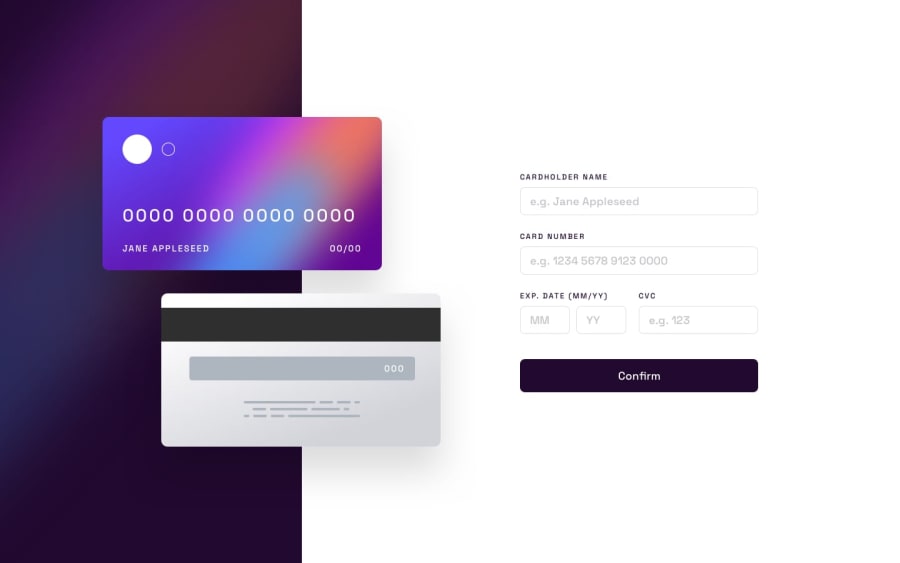
Design comparison
SolutionDesign
Solution retrospective
Hello everyone,
Here is my solution for the " Interactive-card-details-Form " challenge.
Any constructive comments are welcome.
Good coding !
Community feedback
- @AdelinkedPosted about 2 years ago
Hello Misa, I saw your preview site and I liked a lot the work you’ve done here and I’ve some suggestions you can consider applying to your solution :
- When the screen width is less than 925px the card display section will hide the card details section. what i suggest to fix that is adding a margin-top to the card details section:
@media  screen and (max-width: 925px) {
/* your other rules here*/
 .card-details{
        position: relative;
        flex: 0 1 65%;
        margin-top: 300px;
    }
}
I tested this on both Firefox and Chrome with the desktop display and with the different devices they provide in their dev tools and it looks good.
- In the same context at some points when reducing the browser window width the card preview (images) collapses with the card details (the form) for that you need to adjust the left position property of your .card-front and .card-back classes along with the appropriate media queries.
- Finally, i want to remind you to update the Readme file of your solution in the source repository so you can share with us what you've learned from this project and the path you followed to achieve your goal.
Marked as helpful1@DervisevicMPosted about 2 years agoHello @Adelinked, Thanks for your suggestions, I will consider it. 👍
1
Please log in to post a comment
Log in with GitHubJoin our Discord community
Join thousands of Frontend Mentor community members taking the challenges, sharing resources, helping each other, and chatting about all things front-end!
Join our Discord
