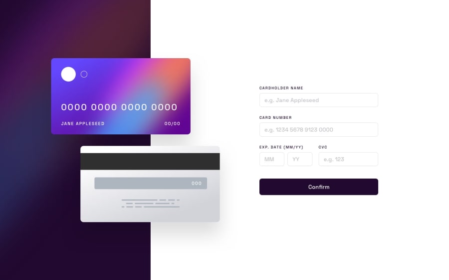
Design comparison
SolutionDesign
Solution retrospective
Was unable to complete the javascript section of this challenge, like my last submission spent more time focusing on layout to make it like the provided material as possible.
Community feedback
- @BilalSalmiPosted about 2 years ago
Hi rick, good job! your design is so good but still need to be optimized.
Accessibility recommadations
Your web page should contain just one <main> element consider using Html semantic elements (landmarks) like <section> <article> <header> <nav> <footer> in your page. Read more about them here.
consider to use html h1 - h6 for your page headings You can read more about them here.
0
Please log in to post a comment
Log in with GitHubJoin our Discord community
Join thousands of Frontend Mentor community members taking the challenges, sharing resources, helping each other, and chatting about all things front-end!
Join our Discord
