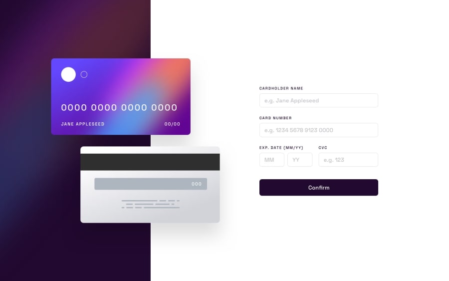
Design comparison
Solution retrospective
I made some corrections to this project.
Thank you for the previous feedback.
#React #styled-components
Community feedback
- @usmanahmedkhan09Posted about 2 years ago
Hi ARIANE’S,
Here are the issues I find out in your design and these are mentioned below:
1- Input fields do not match the design check the internal outline and borders. 2- It Needs proper validation and error messages on the fields like expiry date and month 3- On the mobile screen it shows a horizontal scroll bar that needs some improvements in mobile design.
Marked as helpful0@arianecrestaniPosted about 2 years ago@usmanahmedkhan09 thank you for your feedback
I had fixed some of the design, but I don't know when I see the screenshot here the input size is still the bug there, but when I go to the link still normal
0@usmanahmedkhan09Posted about 2 years ago@arianecrestani did you generate the new screenshot let me know if you need any help related to design or logic
0
Please log in to post a comment
Log in with GitHubJoin our Discord community
Join thousands of Frontend Mentor community members taking the challenges, sharing resources, helping each other, and chatting about all things front-end!
Join our Discord
