Design comparison
SolutionDesign
Solution retrospective
What are you most proud of, and what would you do differently next time?
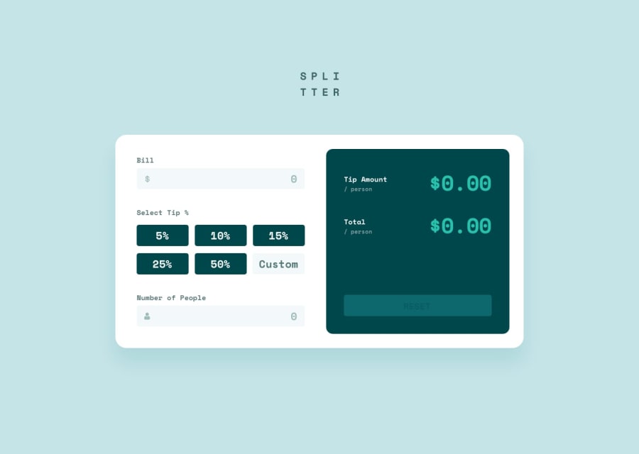
- I'm proud of that my I have managed to create cool interactive app. It is close to the designed one.
- I would simplify my solution next time especially with validation, my code looks a little bit messy and it needs some refactoring.
- I wanted to make it as much interactive as it is possible therefore it took me much more time as I thought cuz of the my validation.
- I have complicated it with no reason but I am happy it works. 😅
- Every opinion and tip will be helpful!
Please log in to post a comment
Log in with GitHubCommunity feedback
- P@nvalline
Hi,
Great job on this challenge. I don't have a lot for you. But you aspect of the design is that when the 'Bill', 'Custom Tip', and 'Number of People' inputs are hovered, then the primary cyan color should be applied.
Other than that the rest of the design looks good and the JS logic is sound for me.
Cheers!
Marked as helpful
Join our Discord community
Join thousands of Frontend Mentor community members taking the challenges, sharing resources, helping each other, and chatting about all things front-end!
Join our Discord
