Submitted 6 months ago
Interactive social link profile using CSS flexbox

@youngimmortal-p

Design comparison
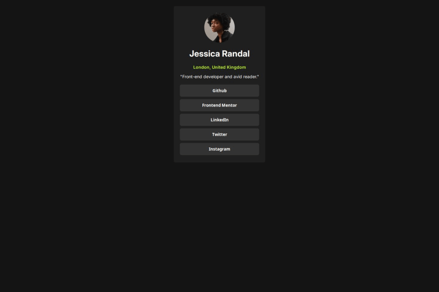
SolutionDesign

Solution retrospective
What are you most proud of, and what would you do differently next time?
I learned how to use the CSS transition property
Community feedback
Please log in to post a comment
Log in with GitHub
Join our Discord community
Join thousands of Frontend Mentor community members taking the challenges, sharing resources, helping each other, and chatting about all things front-end!
Join our Discord