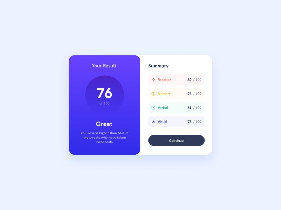
Design comparison
SolutionDesign
Solution retrospective
I used a LOT of custom CSS variables. Too much maybe? Would it have been better to just keep the colors with their respective rules?
Community feedback
- @0xabdulkhaliqPosted about 2 years ago
Hello there 👋. Congratulations on successfully completing the challenge! 🎉
- I have other recommendations regarding your code that I believe will be of great interest to you.
HTML 🏷️:
- This solution had generated some accessibility error reports, to clear that kindly follow these instructions
<div role="button" class="button"> <a href="#"> <p class="bold white">Continue</p> </a> </div>- instead try this,
<a href="#">
      <div role="button" class="button">Continue</div>
</a>
- And we always want to avoid skipping heading levels, Starting with
<h1>and working your way down the heading levels (<h2>,<h3>, etc.) helps ensure that your document has a clear and consistent hierarchy. Source 📘
I hope you find it useful! 😄 Above all, the solution you submitted is great!
Happy coding!
0
Please log in to post a comment
Log in with GitHubJoin our Discord community
Join thousands of Frontend Mentor community members taking the challenges, sharing resources, helping each other, and chatting about all things front-end!
Join our Discord
