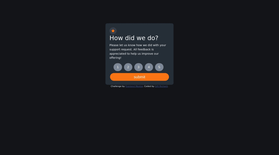
Design comparison
Solution retrospective
wow... my first official javascript challenge... I've only learned the basics when I took on this challenge, so it was a little bit challenging, especially getting the value of the buttons, because we all know buttons don't have value! but it all worked out in the end😊
Community feedback
- @DudeldupsPosted over 1 year ago
Hello! Here are some things I can see: Your HTML is hard to read because of the missing indentation. If you use a linter this is usually done automatically for you. 2) Use a descending order for your headings. Each site should only have one <h1> tag. 3) Try using more descriptive class names so other developers and your future self can understand the code better. 4) Avoid wrapping everything into a div. The one for your button for example isn't necessary at all. Hope this helps :)
Marked as helpful1
Please log in to post a comment
Log in with GitHubJoin our Discord community
Join thousands of Frontend Mentor community members taking the challenges, sharing resources, helping each other, and chatting about all things front-end!
Join our Discord
