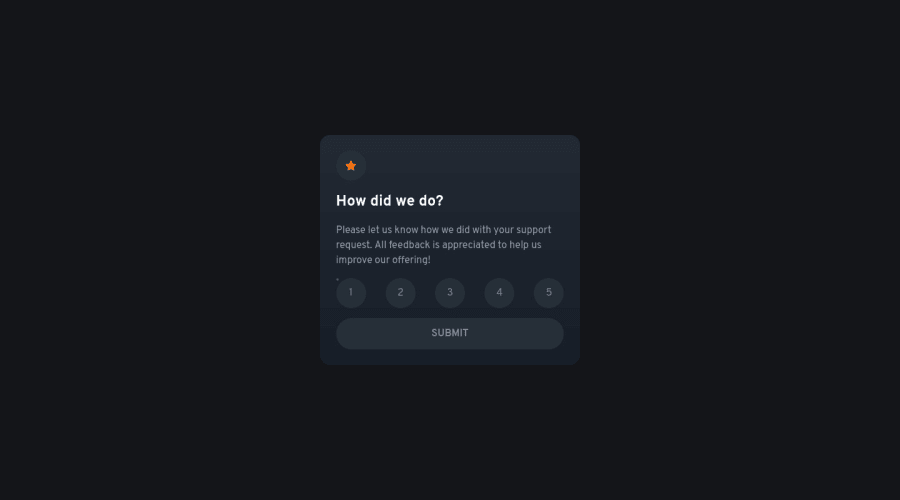
Design comparison
Solution retrospective
First time I've used Nuxt.js. Quite easy to use once you work out how to deploy properly!
Not sure what the parsing error on the HTML validation is about though, presumably a compilation issue?
Community feedback
- @FluffyKasPosted over 2 years ago
Hiyo,
This looks really nice! I can still see the input though as a teeny tiny dot because the opacity is set to 0.1. Is there any reason you didn't set it to 0?
2@fraserwatPosted over 2 years ago@FluffyKas I think
opacity: 0can cause issues with screen readers. How would you approach this?1@FluffyKasPosted over 2 years ago@fraserwat I'd think elements with
opacity: 0can still be picked up by screen readers (as opposed todisplay: noneorvisibility: hidden). Each input have an associated label here as well, that functions as the actual button and that should be sufficient (you can even tab through them with keyboard, so I'd say it's accessible enough).This is my thinking at least. I might be wrong though! If I am, that would be nice to know so I might as it on Slack >.<
3
Please log in to post a comment
Log in with GitHubJoin our Discord community
Join thousands of Frontend Mentor community members taking the challenges, sharing resources, helping each other, and chatting about all things front-end!
Join our Discord
