Design comparison
Community feedback
- @astnioPosted 3 months ago
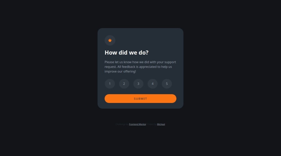
Your solution looks quite sophisticated, and I like how well you document your code! I will say that I feel as though choosing not to use a form for the radio buttons may go against best-practices of using semantic HTML. I can see you tried, but it may prove to be an accessibility issue if this were implemented in a more complicated environment.
Marked as helpful1@alphastand27Posted 3 months ago@astnio , thank you for your feedback. I understand why it might look quite sophisticated especially with the unwanted behavior it is having and I will work on that. I think setting conditions to help produce the desired behavior also might work. Thank you for the compliment for the documentation, I was just pushing to make navigation of the code better for others. If you have any more feed back feel free to share.
0
Please log in to post a comment
Log in with GitHubJoin our Discord community
Join thousands of Frontend Mentor community members taking the challenges, sharing resources, helping each other, and chatting about all things front-end!
Join our Discord
