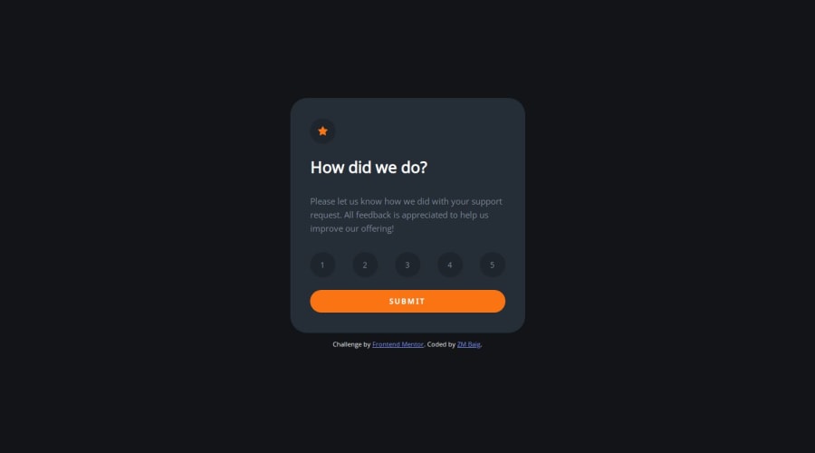
Design comparison
Solution retrospective
Hello everyone,
Here is another solution of "Frondend Mentor Challenge". Any comment or feedback with respect to this project, will be highly appreciated.
With regards,
ZM. Baig
Community feedback
- @danielmrz-devPosted 10 months ago
Hello there! šš½āāļø
Your solution looks excellent!
I have a suggestion about your code that might interest you:
š If you don't have the Figma design files, I recommend using a browser extension called Perfect Pixel.
It allows you to compare your finished project with the design images that come along when you download the project and check the (almost exact) dimensions. It's very useful!
I hope it helps you in future projects! š
Other than that, great job!
0 - @hassanmoaaPosted 10 months ago
Hello @ZMBAIG!
Great Job solving the challenge mate *congrats * š
Some suggestions for improvements.
For the font-size it's is better to use rems and ems but px for this project is no big deal.
.attribution { font-size: 13px; }
-
i see you using pixels for many elements, never use pixels for font-sizes in any element, here's why:
-
Certain font-related CSS properties will render your site completely inaccessible if their value is declared using pixels even once.
Which properties are affected?
All of these properties must never ever be declared in pixels:
- font-size
- line-height
- letter-spacing
If you've used pixels to define any of the above style properties, these will not respect the user's font size preferences!
- You should use ems, and rems for font-sizes would be better
This article may help:
https://fedmentor.dev/posts/font-size-px/
āāāāāāāā
Other than that you're good, keep up the good work!
0 -
Please log in to post a comment
Log in with GitHubJoin our Discord community
Join thousands of Frontend Mentor community members taking the challenges, sharing resources, helping each other, and chatting about all things front-end!
Join our Discord