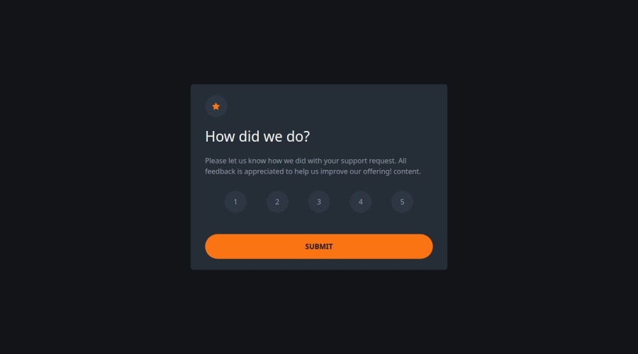
Design comparison
Solution retrospective
I am really proud of completing the challenge with Bootstrap. This is my second time using it so it took me a while to look up all the classes, but I can see how it could make workflow more efficient in the future. I added a vote again button to the thanks card and an alert to the main card so that if the user tries to submit with out selecting a number.
What challenges did you encounter, and how did you overcome them?The challenges were with the layout and playing around with different column sizes to create a responsive project as it was my second attempt at using bootstrap. I used the documentation constantly and watched a few beginner tutorials to help me.
What specific areas of your project would you like help with?I would like to know if I have used Bootstrap classes efficiently. Is this a good way to tackle the project or would CSS have been preferable?
Join our Discord community
Join thousands of Frontend Mentor community members taking the challenges, sharing resources, helping each other, and chatting about all things front-end!
Join our Discord
