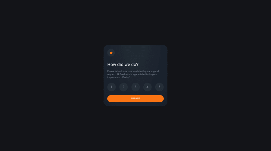
Design comparison
SolutionDesign
Solution retrospective
I find the project challenging rather than difficult. I choose to experiment with new styles that I haven't used before. All the code, that I've written has actually helped me re-think to use certain ways to improve performance. Listing below what I learnt with this project:
- Learnt CSS gradient using farthest corner which I haven't used before to achieve the variation card color from top to bottom
- Learnt CSS a new pseudo class :hover:not([disabled]) to have the hover effect only when button is enabled
- Learnt how to deal with hover & click states on each rating by using event-delegation, which I learnt recently that lifts off extra burden like adding the event on each and every rating and Instead registered the click event on parent div which give's info about the children
- Learnt the importance of letter-spacing, word-spacing, line-height and font-weight to develop a beautiful UI.
- Had the fun in tweaking minor differences like using not-allowed for cursor when the button is disabled.
Community feedback
- @JairthPosted about 2 years ago
I liked your solution! I would only add some transitions with the color change of the buttons. The rest is awesome, good job ^-^
0
Please log in to post a comment
Log in with GitHubJoin our Discord community
Join thousands of Frontend Mentor community members taking the challenges, sharing resources, helping each other, and chatting about all things front-end!
Join our Discord
