Design comparison
Solution retrospective
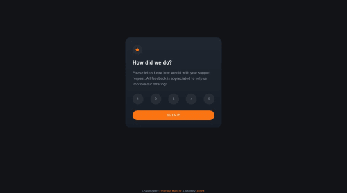
This is my first JS project. It was quite a challenge for me but it seems to work well. Any feedback will be appreciated !
Community feedback
- @bene-volentPosted over 1 year ago
Hi there, congrats on completing the solution. The first time is always hard.
Few recommendations if you won't mind:
- As the following is a component (assuming a part of larger component), consider enclosing it in a div or an article in itself for increasing modularity.
- As you are using button[type=submit], you should consider using a form where the ratings are actually radio buttons with each one storing a rating value and using attached label to show the values instead of button as buttons are only for pressing and not having a [Pressed or Active or Checked] state. check out my solution if you need an example. I also learnt it from someone else.
- Try validating the form, for example, I can just press submit and it allows me to submit. Try validating whether a rating is already selected or not. If not don't show second screen and tell the user that a rating should be selected. This can be done by disabling by lightening the color of submit button or having an animation on it.
Try them one at a time if you have time, and re evaluate your solution. Everyone learns one step at a time
Marked as helpful0@JuHnrPosted over 1 year agoThank you for your recommendations @bene-volent ! My first idea was to use radio buttons and a form, but I didn't find a solution without a PHP script so I changed that (except the submit button). I will check out your solution and try again :)
1@bene-volentPosted over 1 year ago@JuHnr you don't need a php script for this. If I am right about what you are saying, you don't actually need to submit the form, you can handle the onsubmit event in the form and use the preventDefault() on the submit event to stop it from reloading/actualy try to submit. Once you do that, everything is in your control and you can do whatever you want with the html. 😊 Good luck
Marked as helpful0 - @Aimal-125Posted over 1 year ago
Bro your card component is looking great on my desktop but when i checked it on my j3 mobile device it is invisible from top. So, to eradicate this problem use height: 120vh; or height: 150vh; by using media query with max-height: 400px; ::)
Marked as helpful0@JuHnrPosted over 1 year agoThank you for your feedback @Aimal-125 ! I always struggle with that :)
0
Please log in to post a comment
Log in with GitHubJoin our Discord community
Join thousands of Frontend Mentor community members taking the challenges, sharing resources, helping each other, and chatting about all things front-end!
Join our Discord