Submitted 11 months ago
Interactive rating component with HTML, CSS and Vanilla Js

@adityas-github

Design comparison
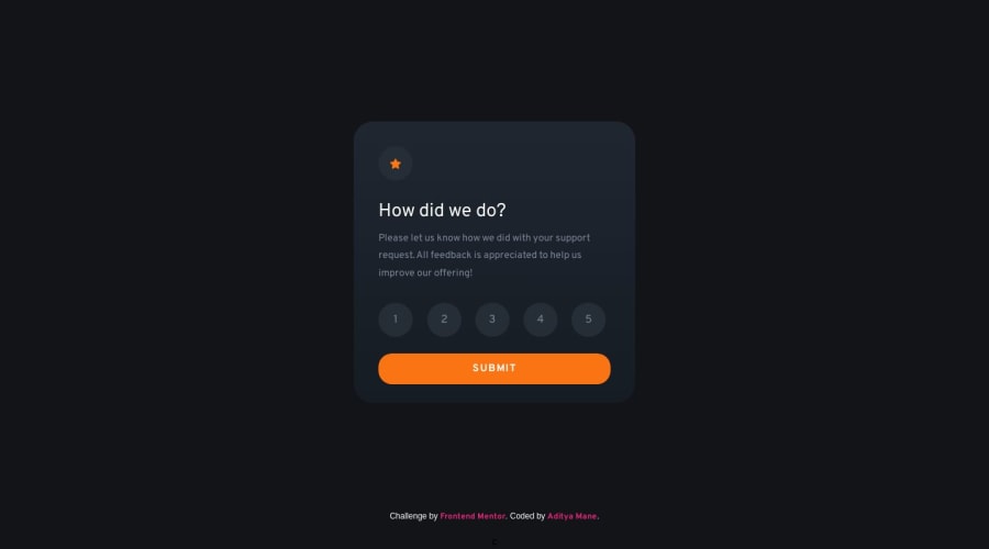
SolutionDesign

Solution retrospective
I'm delighted to have successfully wrapped up this project, utilizing all the knowledge I've acquired to tackle and complete this challenge. Your feedback and comments would be immensely valuable in aiding my growth. Thank you 😊
Community feedback
- @kimodev1990Posted 11 months ago
Really great work for completing the challenge, Just a few feedback :-
- You could use clamp ( ) method in your coding for font-size, width, margins, padding, etc., So the designed sizes will change according to the viewport dimensions having a responsive design and will be suitable for any device layout.
- Use rem or em units rather px with font size for better responsiveness.
Hope you find this Helpful.
Other than that, Really Nice work & keep Going on .
Marked as helpful1

Please log in to post a comment
Log in with GitHub
Join our Discord community
Join thousands of Frontend Mentor community members taking the challenges, sharing resources, helping each other, and chatting about all things front-end!
Join our Discord