

Design comparison
SolutionDesign

Solution retrospective
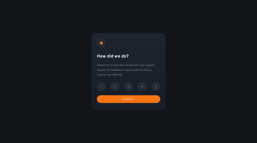
First JavaScript challenge. I manipulated the DOM to make the rating interactive. I did'nt have any complications on that; however, if you see any improvement on my script, feel free to comment!
Community feedback
- @lack21Posted over 1 year ago
Good work 👍, but I have some recommendations!
- Replace
height: 100vhtomin-height: 100vhin thebody, the difference is that, when you setheight: 100vhto something, that means it won't be bigger than that, it might cause some problems in the future, so better approach is to setmin-height: 100vh, like this in case content is overflowing container will adjust to it! - Replace
width: 415pxin the.cardwith thewidth: min(415px, 90%), like this when screen width is smaller than.card,.cardwill adjust to it, and also removewidth: 330pxwhen it goes on smaller screens!
Marked as helpful0@develobaPosted over 1 year ago@lack21 you're right, I'll change it! Thanks for the help, I still need to learn best practices for responsiveness.
0 - Replace

Please log in to post a comment
Log in with GitHub
Join our Discord community
Join thousands of Frontend Mentor community members taking the challenges, sharing resources, helping each other, and chatting about all things front-end!
Join our Discord