Design comparison
Solution retrospective
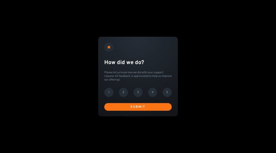
I was not able to get the background colours right for this project.
How should the rating circles be made accessible? Should this component be a form with HTML radiobuttons and a submit button? Is it possible to style these appropriately?
I was also not sure how best to enforce that the container should be the same size for both states. I wasn't sure if I should be setting explicit dimensions on the container for this.
Community feedback
- @FluffyKasPosted about 1 year ago
Heyo,
Your solution looks great! I think it's okay to deviate from the original challenge every now and then, I think your background gradient is actually nice.
As you said, the best solution for this would be a form with radio buttons. It's a bit tricky to style it but possible. Essentially, you'd want to visually hide the original radio buttons and style their labels to look like the numbered buttons. Probably adding a legend as a title ("Ratings") is a good idea too.
I think the only way to ensure the cards are the same size would be setting their width to be a fixed value which yes, might lead to issues with responsiveness (although you could play around with media queries but it's a lot of hassle for a small problem). I think, what you did here looks great, the two cards, at least to me, seem almost identical so I wouldn't worry about it.
Overall, even if you didn't choose the most accessible path for this challenge what you did is great. Looks like you put a lot of effort into it, so well done!
0
Please log in to post a comment
Log in with GitHubJoin our Discord community
Join thousands of Frontend Mentor community members taking the challenges, sharing resources, helping each other, and chatting about all things front-end!
Join our Discord
