Submitted almost 2 years ago
Interactive Rating Component with dialog element
@je-jo
Design comparison
SolutionDesign
Solution retrospective
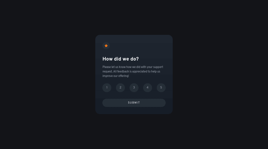
The project uses hidden radio buttons for ratings, and a dialog element to show the "Thank you" card.
All feedback is appreciated.
Community feedback
- @AhmadYousif89Posted almost 2 years ago
Hi there 👋
Nice work with this challenge, I know that this is a beginner challenge but I just have a couple of notes regarding your solution :
- user can submit his/her rating even w/o selecting any rate (doesn't make a lot of sense 😅) I would disable the submit button until the user select a rating otherwise leave it disabled.
- you have - imo - unnecessary div "wrapper-rating", I don't think you need it because you already have a fieldset wrapping the inputs inside, but in this case I would use a grid with 2 rows one for the legend and the second for the inputs distributed in 5 cols, but this is just me 🤷♂️
- you have some accessibility issues like when using the tab key to navigate with the keyboard it's just focus on the 3rd input and the submit button 🤔
- you don't really need the dialog element you can just render it's content in the div "card" after submitting
- I would prefer having a clickable button that say for example "close" rather than clicking any where to close the modal and reset the state.
You have a nice day 👋
Marked as helpful0@je-joPosted almost 2 years ago@AhmadYousif89 thank you for the valuable feedback!
- Maybe I misunderstood but I can't replicate this. The button is disabled until the user selects a rating. I have now added back the disabled attribute after the modal is closed, perhaps that's what you meant?
- Agree, it's a leftover. I changed it as per your suggestion.
- Again, maybe I misunderstood, but when using the keyboard, when the rating input is focused, you can use the arrow keys to choose a rating, which is the default behaviour for radio input groups, I believe. I agree it may be a bit confusing, so I'll just stick to regular buttons from now, probably.
- Agree it's not really needed, it's more of a choice.
- I would prefer the close button too, but I was following the given design which doesn't have any.
Thanks again, and have a great day!
0@AhmadYousif89Posted almost 2 years ago@je-jo
I see you have fixed all the main issue and this is awesome 👍
- the submit btn is now disabled until a rating is selected
- focusing on the inputs with the tab key is working as it should now
- using the input with the radio type is the correct chose no need for actual btns
good job 👍
0
Please log in to post a comment
Log in with GitHubJoin our Discord community
Join thousands of Frontend Mentor community members taking the challenges, sharing resources, helping each other, and chatting about all things front-end!
Join our Discord
