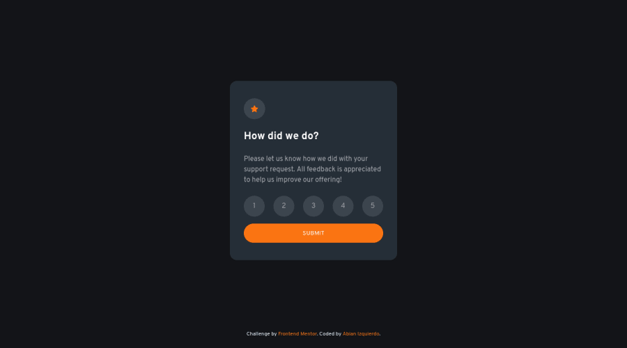
Interactive rating component w/ React & TailwindCSS


Design comparison

Community feedback
- P@jyeharryPosted about 1 month ago
Most importantly, the accessibility around the radio buttons could be improved.
For starters, there are no
:focus-visiblestyles meaning when I tab through the page I can't tell whether I've focused onto the inputs.:focus-visiblecan be used to add an outline around the inputs to make it clearer they have focus, which is the case when the submit button is focussed.Secondly, when going over the radio buttons with a screen reader, all that's read out is "Unchecked, Radio button - <num>". This isn't very descriptive to a person using a screen reader especially since the body text doesn't actually explain that they're leaving a rating out of 5.
You're using tailwind which believe has a
.sr-onlyclass which visually hides its content but keeps it in the dom, so that it can be read out by screen readers. So you could do something like<span class='sr-only'>Rating </span>1<span class='sr-only'> out of 5</span>and the screen reader would read out "Unchecked, Radio button - Rating 2 out of 5"A few more more minor things:
There's no need to use opacity on the
You selected <num> out of 5text. It gives it the appearance that the text is 'muted' or disabled.The padding for the card is actually different on large screen vs mobile screen. On large it's 2rem, mobile it's 1.5rem. Try using
clamp()to generate a fluid value that can be used here, it'll save having to use an arbitrary breakpoint. Have a look at Utopia for generating theclamp()value.0

Please log in to post a comment
Log in with GitHub
Join our Discord community
Join thousands of Frontend Mentor community members taking the challenges, sharing resources, helping each other, and chatting about all things front-end!
Join our Discord