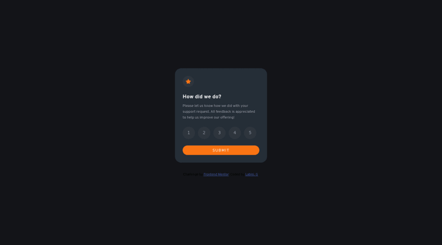
Design comparison
Solution retrospective
Just started out on javascript, so happy achieving this. Opinions will be appreciated.
Community feedback
- @correlucasPosted about 2 years ago
👾Hello @labisigloria, Congratulations on completing this challenge!
Your component is perfect, but is not responsive yet, this is due the
fixed widthyou've applied to the container.Look bothwidthandmax-widththe main difference between these properties is that the first(width) is fixed and the second(max-width) isflexible, for example, a component withwidth: 320pxwill not grow or shrink because the size will be ever the same, but a container withmax-width: 320pxormin-width: 320pxcan grow or contract depending of the property you've set for the container. So if you want a responsive block element, never usewidthchoose ormin-widthormax-width.✌️ I hope this helps you and happy coding!
Marked as helpful0 - @hyrongennikePosted about 2 years ago
Hi @labisigloria,
Congrats on completing the challenge
Just a suggestion, instead of giving 5 when no rating is selected I would suggest just disable the button until a rating is selected this can be done by adding the disabled attribute on the button and removing it when the rating is clicked.
Also check the report above there a few issues.
Hope this is helpful.
Marked as helpful0
Please log in to post a comment
Log in with GitHubJoin our Discord community
Join thousands of Frontend Mentor community members taking the challenges, sharing resources, helping each other, and chatting about all things front-end!
Join our Discord
