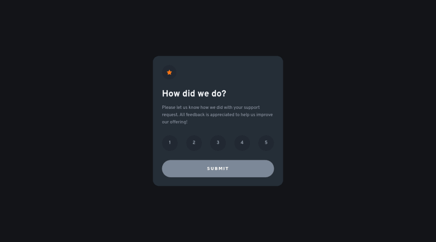
Interactive rating component using vanilla Front-end tech stack
Design comparison
Solution retrospective
- I'm not sure I applied BEM correctly. What would you change?
- I feel like the ratings number are not fully aligned center in the circle. How would you achieve that?
Community feedback
- @elaineleungPosted over 2 years ago
Hi Lucas, well done for your first challenge! To shift the numbers, maybe you can try adding a
padding-top: 1px
(or whatever value works for you) to your.ratings__rating
selector.Regarding BEM, it feels like people all do things a little differently depending on what suits them best. For me, I normally try to keep things short and readable, and I try to avoid repetition just for better readability. For instance, since there's only one component here, I'd probably just use
component
instead ofrating-component
, and then the children would becomponent__icon
,component__title
,component__ratings
, etc. For the ratings, I might either usecomponent__ratings-num
orratings__num
. What helped me when I first started learning BEM was videos/tutorials from Kevin Powell and Gary Simon. Even though I've been using other systems, I still use BEM for naming, and I think the more you use the system, you'll be able to adjust accordingly.Once again, good job, and welcome to Frontend Mentor!
Marked as helpful1 - @ibra-sanPosted over 2 years ago
Good job on completing the project. Quite honestly I don't know if I should give you advice or not because you have done better than me in terms of accessibility and html issues.
Well I am not perfect in BEM and I have been struggling with it, but reading this BEM documentation should help. Now this is around 10 -30 minutes read depending on how fast you digest content (Link: https://en.bem.info/methodology/html/). After reading the documentation you will have a very solid understanding of BEM.
The link I sent is for BEM regarding HTML; however, there is BEM regarding JS, there is file structuring, etc. Basically this website will help you organize your projects, hence give them a read as well if you wish.
Bonus tip: Use BEM with Sass / Scss and you will see how quick and organized are your styling flies.
-> When it comes to circles and centering content in them: 1) I create a square. Meaning make sure the width and height are the same size. 2) Border radius the square to its max. Meaning make sure the border radius of the square is a huge number. There is a certain threshold for border radius that if you pass the border radius will stop been bothered. The bigger the number that more sure you will be about passing that threshold. 3) Flex the square (circle after step 2), justify the content to center, and align the items center. Everything inside that circle will be vertically and horizontally aligned.
Anyways congrats on completing the project.
Marked as helpful0 - @rmnnnPosted over 2 years ago
Hello Lucas,
I would say this is a great beginning for Frontend Mentor. As you have noticed there are plenty of new challenges to be soluted. Regarding that, I would say that this place is great to create one of your portfolio projects.
If I was in your place, after I've done javascript, I would focus on the style of the app, or even before javascript. You can follow the style guide that is given to you.
If you see this feedback as helpful, please leave a mark down there.
Regards, Ermin.
Marked as helpful0 - @mubizzyPosted over 2 years ago
Excellent job on this challenge!
Hope it helps:)...don't forget to mark it as helpful 👍
0
Please log in to post a comment
Log in with GitHubJoin our Discord community
Join thousands of Frontend Mentor community members taking the challenges, sharing resources, helping each other, and chatting about all things front-end!
Join our Discord