Design comparison
Solution retrospective
Feedbacks are welcome. What do you think about the code quality?
Community feedback
- @mseidel819Posted over 2 years ago
This looks great!
a couple super easy fixes that will get rid of some accessibility and HTML issues:
-
make sure to put
alttags on all of your images. Because your images in this app are more for style, and not necessarily "important" to the users functional experience, you could addalt=""inside your images. -
the
idtag can only be used once. It is a very specific property. try changing yourid=btn2toclass=btn2. -
I think if you change your
<div className="App">to<main className="App">you will clear up another accessibility issue. -
You need an
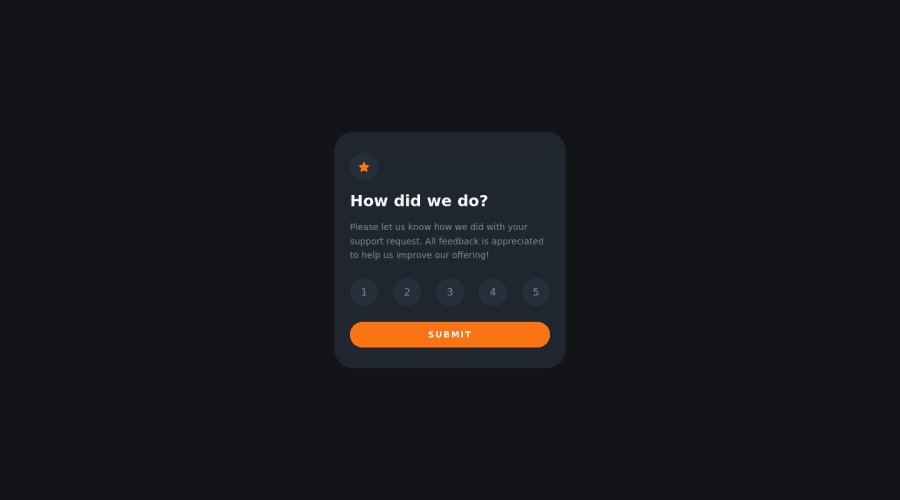
<h1>tag somewhere (but only 1). Maybe try changing<h2>How did we do?</h2>to<h1>How did we do?</h1>(and then style it so that it looks the same as before).
I THINK this should clear everything up. Then, this app will be looking really clean!
Marked as helpful0 -
Please log in to post a comment
Log in with GitHubJoin our Discord community
Join thousands of Frontend Mentor community members taking the challenges, sharing resources, helping each other, and chatting about all things front-end!
Join our Discord
