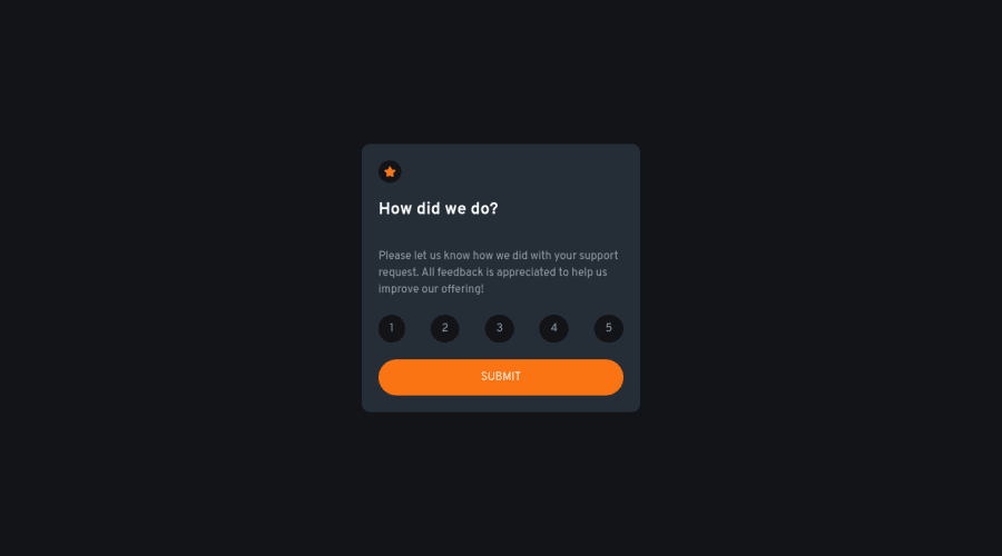
Design comparison
Solution retrospective
I had trouble figuring out which colors correspond to which section, so I adjusted and went with what I felt looked the best. I feel that my SCSS file could be cleaner and wasn't exactly sure where to place my <main> tag.
Community feedback
- @DavidMorgadePosted about 2 years ago
Hello Angelo, congrats on finishing the challenge! pretty good job using react + react router
If you don't mind I'll try to give you some feedback:
-
Regarding your question, you can place your main perfectly wrapping all of your rating component, and also the thank you component since they are a different page and are the main content of their corresponding page.
-
For the SCSS, you should try using SCSS modules, each SCSS file will only affect the component that is attach to, it will make your code more readable and also you will never have classes with the same name. Having your code structured in various files will always be a better approach than having everything in just one file.
-
As a React developer, I would also recommend you to separate your work in components, having everything in one big file takes out the magic of react, make components of everything, buttons, containers, text... in this little project maybe is not that usefull, but for large project it will help you not repeating yourself, and also having your code much more clean and organized.
Hope my feedback helps you, if you have any questions, don't hesitate to ask!
Marked as helpful1@SengsithPosted about 2 years ago@DavidMorgade Thank you for the feedback and tips, they are very helpful! I'd definitely like to try all of these out next time!
1 -
- @AmdjedSaneroPosted about 2 years ago
i like it , you can feedback my same design (i am use free frontendmentor i dont have figma )
0
Please log in to post a comment
Log in with GitHubJoin our Discord community
Join thousands of Frontend Mentor community members taking the challenges, sharing resources, helping each other, and chatting about all things front-end!
Join our Discord