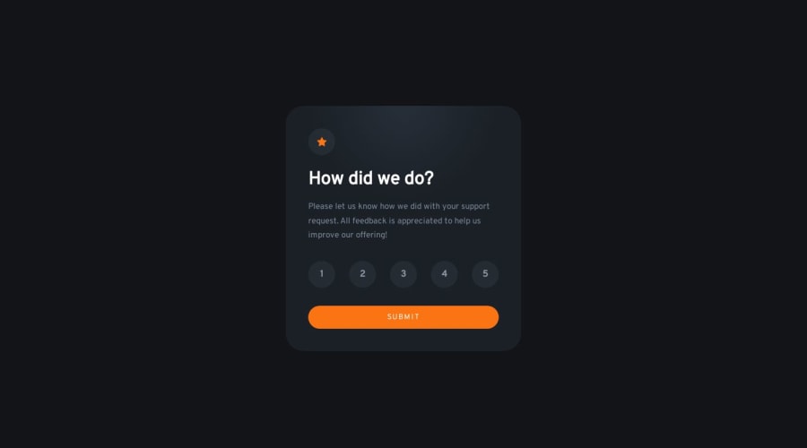
Interactive rating component using query string params
Design comparison
Solution retrospective
Challenging parts
- Customized radio buttons with almost only CSS
- How to manage states between two pages
- Color gradients
First problem I feel I got away with not writing a lot of js code for the radio buttons, had to familiarize myself with new a CSS selector I havent used before which was the general siblings selector (~). Glad I did.
Second problem couldve been solved with cookies/local storage, I shouldve maybe have gone that route. But I felt it was easier to use query params.
Third problem, was trying to match the background color with the designs. That actually took a lot of time. Will be using radial-gradient more from now on.
Appreciate any feedback on any part of the code, please let me know if there is anything that shouldve been different.
Thanks!
Community feedback
- @danielmrz-devPosted 10 months ago
Hello @fuzzboii!
Your solution is excellent!
I have just one suggestion:
- Add a validation with JavaScript to check if the user chose a number before submitting. Like if the user tries to submit without choosing a number, it won't be possible to submit.
Currently it's possible to submit without choosing a number on your project. It's just an extra validation that improves the project!
I hope it helps!
Marked as helpful1@aronsnPosted 10 months agoHey @danielmrz-dev, thank you for the pointer! Have made a new deployment with this as a change.
Best, Aron
1@danielmrz-devPosted 10 months ago@fuzzboii
Just checked it! That's exactly what I was talking about!
It is even better now 😊
Glad I could help!
1
Please log in to post a comment
Log in with GitHubJoin our Discord community
Join thousands of Frontend Mentor community members taking the challenges, sharing resources, helping each other, and chatting about all things front-end!
Join our Discord
