Design comparison
Solution retrospective
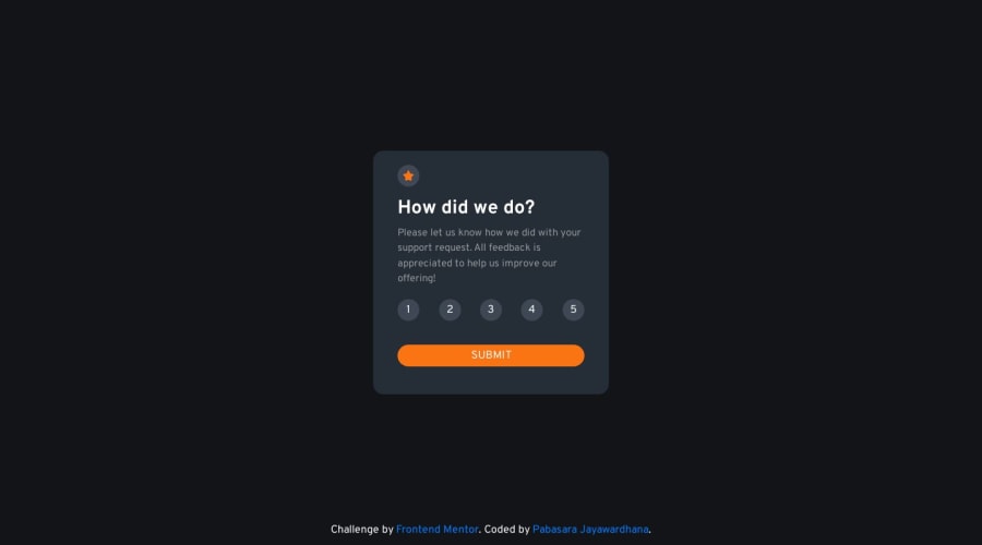
When I was doing this challenge there were some difficulties that I experienced. 1)Responsiveness of the page: I wanted to check the responsiveness on different screen sizes so I searched on Google and found a Chrome extension called mobile simulator according to it (I checked on different mobiles) my page is good but when I checked using my phone (iPhone 11) the numbers in rating buttons have slightly deviated and I also checked using a Samsung (M03) phone and it works fine in it. So I am doubting the accuracy of that Chrome extension (iPhone 11 view on that extension is good and it didn't show any problem.) and I want to know if is there any better software that I can use to test the mobile view.
- Clean code: I tried to keep my code clean but I feel it is a little messy. So I want to know about the best practices of clean code and if is there any sequence of prioritizing when writing code ( Ex: I started with mobile view) so that it will be efficiently rendered in the browser as well as it will be easy to understand.
Additionally,
- I wanted to connect my interactive rating component with a server (using node js) but it failed. The main reason is I couldn't send the rating value to the server via the form (I wanted to send the rating value after hitting submit button). I searched this on Google but couldn't find a helpful answer.
and also any other feedback about my work is welcomed.
Community feedback
Please log in to post a comment
Log in with GitHubJoin our Discord community
Join thousands of Frontend Mentor community members taking the challenges, sharing resources, helping each other, and chatting about all things front-end!
Join our Discord
