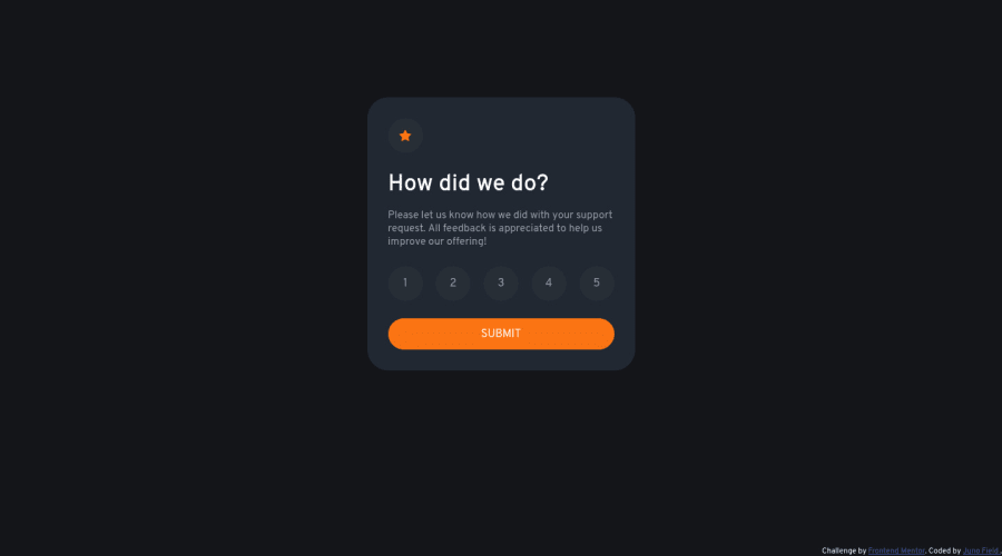
Interactive rating component using HTML, SASS, JS and Parcel
Design comparison
Solution retrospective
As a beginner with little experience, I'm certain that my code is far from good and I'm looking for constructive criticism, so please be kind but honest.
Particularly of note is the radio buttons - because of the layout and lack of an actual "check mark", making them visually show selections using CSS alone was beyond my ability. I resorted to using JS for this instead - probably a bloated and "hacked-together" approach, but the end result is functional.
Also, to be honest using SASS and Parcel was probably a mistake for this project specifically - it was not necessary and overcomplicated things, especially with regards to publishing the site via Github Pages.
Thanks in advance to anyone who decides to leave feedback - it's much appreciated!
Community feedback
- @turtlecrabPosted over 2 years ago
Hey, it's very easy to make radio labels react to
checked
state without any js, just put inputs and labels side by side, input then label, and use+
css selector like that:input:checked + label {...}
. That's how I did it in this challenge following BEM class naming convention:.card__radio:checked + .card__radio-label { background: $primary; color: $white; }
If you put inputs inside labels I think there is no easy way to achieve this, as far as I know there is no way to get a parent css selector from the child, and we need to bind our label selector to
:checked
pseudo-class of an input(maybe I'm wrong and there is a way, but there are no reasons to make it harder). The only thing you'll have to add isfor
attribute for the label like this:<label for="input-id"...
so a label knows which input to check on click.About your javascript code which handles class toggles - it's not needed if we rewrite our layout as shown above, but as it's written I have a feedback. There are 5 almost identical functions that handle label clicks. If you haven't read about DRY programming principle yet (which stands for don't repeat yourself), then google it, it's the first principle we should be learning about. Here we can safely instead of 5 functions write just one:
function handleRadChange(number){ EnableButtonResetColours(); document.getElementById("circle-" + number).classList.add("select-circle-clicked"); }
And html:
<label id="circle-1" onclick="handleRadChange(1)" ... > <label id="circle-2" onclick="handleRadChange(2)" ... > ...
The code is much simpler and if you decide to add some other functionality you'll have to add it to one place and not 5.
So looking for duplicate code is good and we should do it and try to remove duplication when it's making sense. But if you are a beginner don't go crazy about it, start with just noticing duplicate code and do nothing about it. Then maybe when it's really similar like in the example above start trying to refactor it if you are feeling like it. If you are not, don't bother and leave it duplicated, it's totally fine at this stage. And sometimes it's just better to leave duplicate code(see here and here)
Also you should add
node_modules
directory into your.gitignore
file, as well as parcel related directories:.parcel-cache
anddist
. Just write them 1 directory per line. These are not supposed to be a part of git repository and.gitignore
is where we list such files/dirs.If there are issues with deploying to Github Pages, try Vercel - I use it and it's just couple of clicks to add a repository and build it. I think with Vercel you don't even need to write a build script, it detects parcel automatically. Another choice is Netlify.
Marked as helpful1@JunoFieldPosted over 2 years ago@turtlecrab Thank you! I wasn't able to get the radio buttons to display properly so I had to continue using JS - I've cleaned it up considerably now though (was planning to anyway tbh).
Regarding git, I later found a way to get the dist folder's contents into its own branch using this action: (https://github.com/marketplace/actions/push-git-subdirectory-as-branch). Due to this I was not able to add dist to gitignore, but I've added the other 2 items you mentioned. I'll check out Vercel for future projects and see if it meets my needs.
Overall you've been very helpful - thanks very much for taking the time to write this!
0 - @Sdann26Posted over 2 years ago
Hi Juno!
Recommendations I would make
- Use transitions, because it is aesthetically more pleasant to generate that transition effect when clicking or passing the cursor over an element like this, for example: To the class select-circle add
transition: all 200ms
to the class select-circle addtransition: all 200ms
. - To the button with the text SUBMIT add
letter-spacing: 2.5px
this allows that the letters are separated the amount depends on what you believe convenient but in the design this way. - To the div with the class attribution change it to <footer class="attribution"> since it is outside the main but it is inside the body and it is considered one more section of the page.
- To the images always add the alt attribute even if it is empty, if it is empty also add the attribute aria-hidden="true". In the first case is that if they are relevant images you add an alternative text and in the second case for accessibility issues you are mentioning that this image is more of an ornament that is why the aria-hidden.
Otherwise as far as I have reviewed it seems to me that you have done a good project, the design is really good, there is always one or another thing that we do not know but we are investigating or we are warned that we are missing so go ahead, the last two points I mention are for the report, I recommend you always review the report that generates you frontend mentor to clean the errors and generate a new one without these.
Without anything else to say good luck and keep it up.
Marked as helpful1@JunoFieldPosted over 2 years ago@Sdann26 Thanks - will definitely make those improvements!
1 - Use transitions, because it is aesthetically more pleasant to generate that transition effect when clicking or passing the cursor over an element like this, for example: To the class select-circle add
Please log in to post a comment
Log in with GitHubJoin our Discord community
Join thousands of Frontend Mentor community members taking the challenges, sharing resources, helping each other, and chatting about all things front-end!
Join our Discord