Interactive Rating Component using HTML, CSS, JavaScript


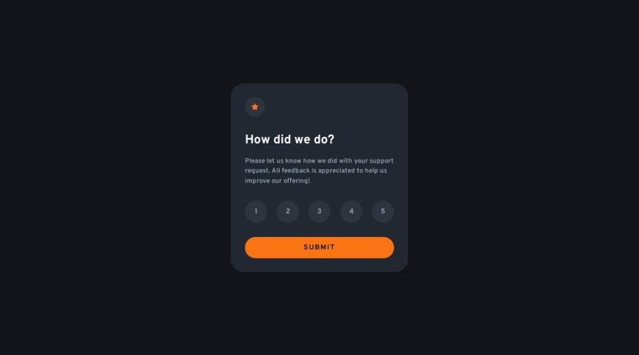
Design comparison

Solution retrospective
I am very pleased with how the project has come out and how close that I appear to have got to the provided design.
What challenges did you encounter, and how did you overcome them?The main challenge that I faced was the styling of the radio inputs. After a few attempts to figure this out without any assistance, I had to resort to searching for a solution online. I found a short youtube video which was really helpful (link in the project README) and I was able to adapt the methods in the video to work with this project and I am overall really happy with the results.
What specific areas of your project would you like help with?I am still not sure if the form I have created could be better structure or handled when the submission is made. I am also sure that my CSS could be optimised better and that is something I need to work on so that I am not unessessarily repeating style which could be grouped together.
Community feedback
- @grace-snowPosted 7 months ago
I'm afraid this has some serious accessibility problems. It's great you've used a form with radio inputs but there are specific requirements around that you need to follow.
- This group of radios should be in a fieldset (or role="group") with a legend (or aria-labelledby referencing some on screen text).
- there should be no click event listeners anywhere, just one submit event listener on the form.
- the inputs must not be display none! That removes them from the accessibility tree. You need to accessibly hide them instead.
- font size should be in rem, never px.
- it's really important to never limit the height of elements that contain text. That includes the wrapper, and component (the cards/panels). Min-height is fine to use (but unnecessary on the component). Let the browser do it's job and decide what height is needed based on the content inside the card.
- the component must not have a width either. Use max-width in rem instead. This allows the component to shrink narrower when needed like on smaller phones.
- don't style on IDs. That's not what they're for and is causing unnecessary duplication in CSS.
- don't forget to add :focus-visible styles. When the inputs are focused by keyboards it needs to be obvious on the label visually.
- there is no need for a media query in this. Once the above changes are made you can remove it. But for future reference, don't write media queries like this. Style mobile first and use min-width media queries, preferably defined in rem or em not px so that the layout scales nicely even when users have a larger text size setting.
- don't change inline styles in js. Let css handle all styling. Js should only toggle attributes or classes.
- once you've changed js to only use one submit listener you will be able to get the chosen value from the form data. E.g.
form.rating.value.
Marked as helpful2@rjmills87Posted 7 months ago@grace-snow Thank you Grace for such concise feedback. I clearly have a lot to learn, especially regarding accessibility as I thought I had done a good job here.
I shall go back and implement all of your recommendations into the project.
0@rjmills87Posted 7 months ago@grace-snow I have gone through all of the points you raised regarding the issues with my project. If you do have a spare moment at some point I would really value your feedback to see if I have implemented the resolutions to these problems correctly.
Thank you again, I have learnt so much I didn't know just from going back over these issues.
0@grace-snowPosted 7 months ago@rjmills87 I don't understand why you've got all that duplication in the CSS and unnecessary classes in the HTML. Each label and input are styled exactly the same as each other. They don't need separate styles.
The
legendcan't be display none. As said previously (I think), that removes the element from the accessibility tree, meaning the fieldset is effectively unlabelled.Note, there is a contrast problem when someone does :focus-visible only. The text is still grey but the background colour has gone orange.
I think there was a style in the design with a grey background on the design too, but I can't see that in your solution anywhere.
Marked as helpful0@rjmills87Posted 7 months ago@grace-snow I have now gone through and refactored the HTML and CSS files to ensure there are no longer any unused/unnecessary classes as well as removing the duplicated CSS. Very sloppy of me and I will learn from this and make better decisions going forward.
I have set the
legendto thevisually-hiddenclass the same as theradioinputs in order for it to remain accessible.I have hopefully rectified the contrast issue when a user does
:focus-visibleby using white text on the orange background in place of thevery-dark-blue.Regarding your last point I don't see anything in the design that I haven't implemented. I am using the
.jpgfiles provided and don't have access to the Figma file provided with the Pro Tier incase what you are referring to is referenced in there.0@grace-snowPosted 7 months ago@rjmills87 no I think you’re right actually. The grey colour must be what I saw on someone else’s solution. It looks like your colours follow the design. They must’ve decided to change it for some reason.
Marked as helpful0

Please log in to post a comment
Log in with GitHubJoin our Discord community
Join thousands of Frontend Mentor community members taking the challenges, sharing resources, helping each other, and chatting about all things front-end!
Join our Discord