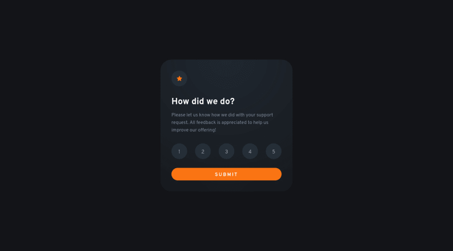
Interactive Rating Component using HTML, CSS & JS
Design comparison
Solution retrospective
Fun project. I'm not good in JavaScript and cannot understand the code, but after this project I am able to read and understand the code. The js code is not completely mine, I saw some solutions to figure out what was happening and then I tried to write the code myself. However the html and css is completely coded by me from scratch. Getting the accurate sizing and margins without the figma file was the hardest part. And I noticed the color of the card was not plain, it was a radial gradient. A lot of solutions I saw made the card plain. getting the exact gradient was very difficult for me. Overall fun project, learned a lot.
Community feedback
- @Mohit-k-MummonPosted about 2 years ago
Great job on completing the project and pushing yourself to learn more about JavaScript! It's impressive that you were able to write the HTML and CSS from scratch and tackle challenges like accurately sizing and positioning elements without the Figma file. And even though the JavaScript code wasn't entirely your own, it's great that you were able to understand and incorporate other solutions to figure out what was happening. Keep up the great work and continue to challenge yourself!
Marked as helpful1 - @sumanth-chandanaPosted about 2 years ago
Hi Hassa Nauman, congrats🎉 on completing the challenge. Better take care about following points.
- Always check Frontendmentor Report Generator issues after submitting the project for removing errors and warnings.
- Use the
alt(alternate text) attribute as mentioned in your Accessibility Report.altattribute is used for Screen readers applications. - Why does alt attribute matter? Read here.
- To avoid accessibility issues "All page content should be contained by landmarks" use code as :
 <body>
    <main>
        ---your code here----
    </main>
  <footer>
  </footer>
</body>
(why does
<main>matter? Read here )- For proper centering the container(whole card) vertically and horizontally you can also use the following simple block of code use code:
body { min-height: 100vh; display: grid; place-content: center; }- When we open the GitHub repository link, you will find an About Section on the right side. There, also include a live preview link of your project. It is better for someone to check your live project while interacting with code.
I hope you will find this Feedback Helpful.
0
Please log in to post a comment
Log in with GitHubJoin our Discord community
Join thousands of Frontend Mentor community members taking the challenges, sharing resources, helping each other, and chatting about all things front-end!
Join our Discord
