Not Found
Not Found
Not Found
Not Found
Not Found
Not Found
Not Found
Not Found
Not Found
Not Found
Not Found
Not Found
Not Found
Not Found
Not Found
Not Found
Not Found
Not Found
Not Found
Not Found

Submitted

Interactive rating component using HTML, CSS and JS

@jadefurtado

Desktop design screenshot for the Interactive rating component coding challenge

This is a solution for...

  • HTML
  • CSS
  • JS
1newbie
View challenge

Design comparison


SolutionDesign

Solution retrospective


What challenges did you encounter, and how did you overcome them?

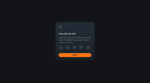
Initially, I tried to make the JavaScript code change the style.display of the thank you card from 'none' to 'block', but this interfered with the layout and the behavior of the flexbox. When you hide the card with display: none, the element is completely removed from the page flow, which can sometimes break the layout when re-displayed with display: block. Instead of using display: none and display: block, it is safer to use visibility and opacity to prevent the layout from breaking when the content is hidden and displayed. I also had to adjust the position of the cards. I created a card-container div to wrap both cards and used position: relative. In the cards, I used position: absolute so that they occupy the exact same space within this container.

Community feedback

@R3ygoski

Posted

Olá Jade, parabéns pela conclusão do projeto, ele ficou muito bem-feito e se assemelha muito ao design proposto.

Sobre a dificuldade que você teve, eu tentei repetir ela e funcionou perfeitamente para mim, veja, eu alterei esses trechos no seu CSS:

.card-2 {
    display: none;
}

.card-2.visible {
    display: flex;
}

e no JS eu alterei esse trecho (Linha 31 e 32):

    ratingCard.style.display = "none";
    thankYouCard.classList.add("visible");

E também funcionou sem problema algum aparente. O que faz crer que talvez tenha tido problema no Layout devido ao uso de position.

Sobre você ter utilizado a position, isso não era necessário. Você poderia remover a div.card-container e deixar com que os elementos fiquem diretamente como filhos da <body>, daí basta remover a position dos cards, e assim os elementos estarão centralizados.

E uma coisa que eu notei, é que seu CSS está um pouco confuso, pois você acabou repetindo classes de forma desnecessária. Como por exemplo na linha 56 - 59 e 137 - 140, uma forma de corrigir isso seria agrupando ambos, que assim facilita na legibilidade do projeto.

Outra coisa que notei, foi o aninhamento no CSS, isso também não é necessário, por exemplo, ao invés de .card-2.visible daria para usar .visible. Isso vale também para trechos como esse: .card__buttons button.selected onde o .card__buttons poderia ser removido.

Agora uma dica quanto ao seu HTML, ele está bem estruturado, mas está muito pouco semântico, algumas tags poderiam ser alteradas para tags mais semânticas como por exemplo:

  • div.card__buttons poderia ser uma <section> pois ela está fazendo o papel de agrupar elementos relacionados entre si.
  • div.card e div.card-2 poderiam ambas serem alteradas para <article> pois ambas são elementos autoexplicativos.
  • div.card-container poderia ser alterada para <main> pois sempre após o <body> utilizamos <main> e também devido a esse trecho conter a parte principal da página.

E é isso, novamente parabéns, continue praticando e se aprimorando, e caso tenha ficado qualquer dúvida quanto ao que eu disse, por favor, comente abaixo que tentarei ajudar da melhor forma possível.

0

Please log in to post a comment

Log in with GitHub
Discord logo

Join our Discord community

Join thousands of Frontend Mentor community members taking the challenges, sharing resources, helping each other, and chatting about all things front-end!

Join our Discord