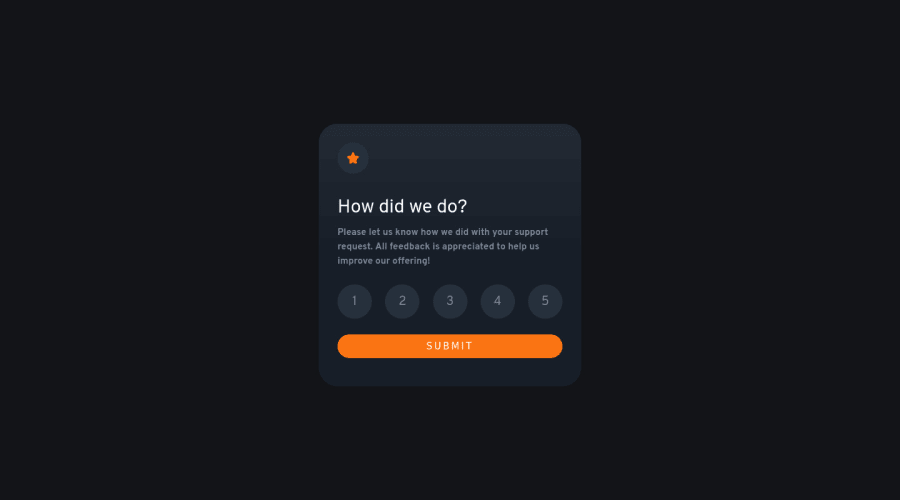
Design comparison
Community feedback
- Account deleted
Hey @Melchor16 👋! After looking through your code I would recommend starting with the easier challenges and working your way up, as there are a lot of errors in your code:
- The
sectionelement is being used incorrectly ⚠️ and not needed for this challenge.
- The HTML for the ratings needs to be rewritten as it was done incorrectly ❌:
To ensure that the "rating buttons" are fully accessible 💯, they need to be built using a
form⚠️.- Everything will be wrapped inside a
fieldsetwhich will have alegendthat is visually hidden using CSS. - Inside, there should be five
input radiosand eachinputshould have alabelattached to it to make the “ratings” accessible. - The last thing you will want to include will be a
buttonso users can submit their choice.
More Info: 📚
- Once the top is implemented , for your JS, the
eventListenershould be on theform⚠️ as asubmit.
More Info:📚
Click vs. Submit EventListeners
- As for the "thank you" content, you will need to announce it to screen readers. So you will need to wrap the entire thank you content in a
divand includearia-live="polite"in it.
- It is best practice ✅ to use,
classesfor styling purposes, while usingidssolely for JavaScript.
If you have any questions or need further clarification, you can always check out my submission and/or feel free to reach out to me.
Happy Coding! 👾
Marked as helpful1@Melchor16Posted about 2 years ago@vcarames thanks! thats a lot of useful information, I'm going to keep practicing with your recommendations.
0 - The
Please log in to post a comment
Log in with GitHubJoin our Discord community
Join thousands of Frontend Mentor community members taking the challenges, sharing resources, helping each other, and chatting about all things front-end!
Join our Discord
