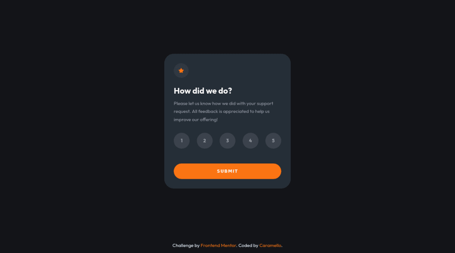
Design comparison
SolutionDesign
Solution retrospective
If you have any suggestions on how I can improve my code, I would greatly appreciate it if you could leave a comment. Thank you in advance. (✿◠‿◠)
Community feedback
- @loganbriggs08Posted over 1 year ago
Looks really good, If you are looking for a bit of an extra challenge try making a gradient for the Card and Rating Buttons that look similar to the component provided by frontendmentor, this will make it look even closer to the original provided by frontendmentor by nether the less you did a great job!
Marked as helpful1 - @AnaRibeiro65Posted over 1 year ago
Para mim o seu site ficou muito bom, mas quando eu fiz esse teste eu usei button
<ul class="lista"> <li><button class="nume" onclick="numero('1')">1</button></li> <li><button class="nume" onclick="numero('2')">2</button></li> </ul> <button onclick="concluido()" class="botao">Submit</button> </nav>0
Please log in to post a comment
Log in with GitHubJoin our Discord community
Join thousands of Frontend Mentor community members taking the challenges, sharing resources, helping each other, and chatting about all things front-end!
Join our Discord
