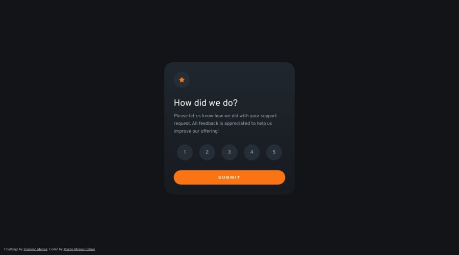
Interactive Rating Component + simple SVG animation
Design comparison
Solution retrospective
πPlease, feel free to leave a comment with tips so I can do it better.
Thank you for visiting!π€
Community feedback
- @0xabdulkhaliqPosted over 1 year ago
Hello there π. Congratulations on successfully completing the challenge! π
- I have other recommendations regarding your code that I believe will be of great interest to you.
HTML π·οΈ:
- This solution may cause accessibility errors due to lack of semantic markup, which causes lacking of landmark for a webpage and allows accessibility issues to screen readers, due to accessibility errors our website may not reach its intended audience, face legal consequences, and have poor search engine rankings, highlighting the importance of ensuring accessibility and avoiding errors.
- The
section
element is not meant to use here, because it cannot define landmark of a webpage
- What is meant by landmark ?, They used to define major sections of your page instead of relying on generic elements like
<div>
or<span>
. They are use to provide a more precise detail of the structure of our webpage to the browser or screen readers
- For example:
- The
<main>
element should include all content directly related to the page's main idea, so there should only be one per page - The
<footer>
typically contains information about the author of the section, copyright data or links to related documents.
- So resolve the issue by wrapping the both
<section>
elements with the proper semantic element<main>
in yourindex.html
file to improve accessibility and organization of your page
.
I hope you find this helpful π Above all, the solution you submitted is great !
Happy coding!
Marked as helpful0 - @VCaramesPosted over 1 year ago
Hey there! π Here are some suggestions to help improve your code:
- Every site should ALWAYS have β
a
main
element not only for semantic purposes but also to help assistive technology find the main content of your content. For this challenge, it will serves as the componentβs container β οΈ.
More Info: π
- The HTML for the ratings needs to be rewritten as it was done incorrectly β:
To ensure that the "rating buttons" are fully accessible π―, they need to be built using a
form
β οΈ.- Everything will be wrapped inside a
fieldset
which will have alegend
that is visually hidden using CSS. - Inside, there should be five
input radios
and eachinput
should have alabel
attached to it to make the βratingsβ accessible. - The last thing you will want to include will be a
button
so users can submit their choice.
More Info: π
- Once the top is implemented , for your JS, the
eventListener
should be on theform
as asubmit
.
More Info:π
Click vs. Submit EventListeners
If you have any questions or need further clarification, feel free to reach out to me.
Happy Coding! πΎ
Marked as helpful0@murilomcabralPosted over 1 year agoHi, @vcarames! Made some improvements and corrections. If you could, please, see if now it is correct.
1@VCaramesPosted over 1 year ago@murilomcabral
It looks better! But the
form
should only be wrapping the rating buttons only. So it should looking like this;form
>fieldset
>legend
> (radios
+labels
5x).Marked as helpful1 - Every site should ALWAYS have β
a
Please log in to post a comment
Log in with GitHubJoin our Discord community
Join thousands of Frontend Mentor community members taking the challenges, sharing resources, helping each other, and chatting about all things front-end!
Join our Discord