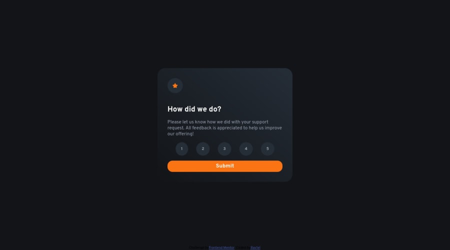
Design comparison
Solution retrospective
Well, another challenge done, but that one was a bit harder, especially bc I ain't the best at javascript, so that part was a bit challenging. And well, as usual, comments and tips on how to improve are welcome.
Community feedback
- @iagohenrique2009Posted almost 3 years ago
Hi friend!
You could add the property cursor:pointer to yours button to make him looks like more a button;
and in your html code you have in blank(i think you has forget to remove);
1 - @Kamasah-DicksonPosted almost 3 years ago
Your solution looks great on desktop but on mobile it seems the width of your card is not enough so its behaving a bit shrinky. You can use a max width instead of just width. Also I really like the gradient you used on the cards background. Good job there👍👍 Happy Coding👍💻
1
Please log in to post a comment
Log in with GitHubJoin our Discord community
Join thousands of Frontend Mentor community members taking the challenges, sharing resources, helping each other, and chatting about all things front-end!
Join our Discord
