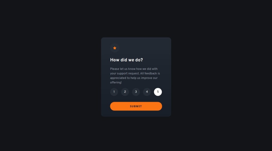
Design comparison
Solution retrospective
I am proud that I am submitting this project
What challenges did you encounter, and how did you overcome them?I didn't encounter any problems
What specific areas of your project would you like help with?Nothing with this project
Community feedback
- P@sikulamartinPosted 7 months ago
You should definitely download the Figma file—it will help you get all the correct widths, heights, and other dimensions. Also, there's no need to use JavaScript for adding active classes. Instead, you can simply use CSS with button:hover or button:focus. Lastly, consider improving the responsiveness of your design.
0
Please log in to post a comment
Log in with GitHubJoin our Discord community
Join thousands of Frontend Mentor community members taking the challenges, sharing resources, helping each other, and chatting about all things front-end!
Join our Discord
