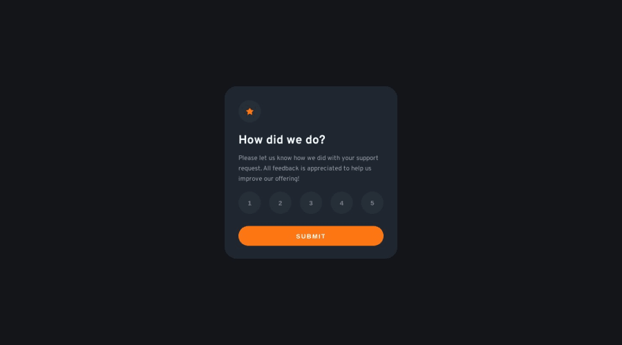
Design comparison
Solution retrospective
Just want to ensure everything looks good. If I'm making any obvious mistakes please let me know!
Community feedback
- @andrea-iriartePosted about 1 year ago
Hi Connor!
Great job on this project! Looking at your code, however, I noticed that there were a few instances of unnecessary repeat code. Specifically, when displaying the row of numbers, it would be better to iteratively execute a block of code by mapping through an array. For example:
<div>
   {
         Array(5).map((index) => (
              <button key={index} className={`number-button ${rating === index + 1? "number-
               button-selected" : ""}`} onClick={() => handleClick(index)}>{index + 1}</button>)
   }
</div>
That's all you need to render the five rating bubbles!
There can only be one parent / outer element within a block like this, and that element must have some sort of key. Ideally the key should be some sort of unique string, but in this case the index from the array works as well.
Also, the variable index is arbitrarily named. I could have called it anything. It is only important to know that it is referring to the element within the array which is currently being targeted as the code iterates through the different items.
You can read more here: Rendering Lists
Marked as helpful1 - @Abhijeet-BhushariPosted about 1 year ago
Great design. You should make it properly responsive.
Also you could add an alert when the submit is clicked without selecting a rating.
0
Please log in to post a comment
Log in with GitHubJoin our Discord community
Join thousands of Frontend Mentor community members taking the challenges, sharing resources, helping each other, and chatting about all things front-end!
Join our Discord
