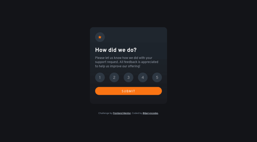
Interactive rating component - React
Design comparison
Solution retrospective
Hi everyone 👋
Great to finally submit a React solution, something I never thought would have been possible this time last year.
It was an excellent chance to practice working with props, useState, raising state up, create react app and utilising accessible html like fieldset and radio inputs.
Any feedback that could help me to improve would be very welcome!
Happy coding 🤙
Community feedback
- @Kamasah-DicksonPosted over 2 years ago
Your solution looks great and responsive on smaller devices but I was suggesting if you could make a transition to the next card section.
Besides great job there👍 Happy coding and have a nice Day👍💻
1@Kamasah-DicksonPosted over 2 years ago@darryncodes you are welcome👍 Have a nice day💻👍
0 - @Esesosa-maxPosted over 2 years ago
- ✅ Good Looking Design 4.3/5
- ✅ Usage of ReactJS 2/2 ( bouns )
- ✅ Servers Function properly 5/5 4 ✅ Good Approach to Challenge 4.5/5
- ✅ Perfectly Responsiveness 5/5
- ✅ Readable HTML structure 5/5
- ✅ Pro Tip: Your
font-sizeis a little too much
1
Please log in to post a comment
Log in with GitHubJoin our Discord community
Join thousands of Frontend Mentor community members taking the challenges, sharing resources, helping each other, and chatting about all things front-end!
Join our Discord
