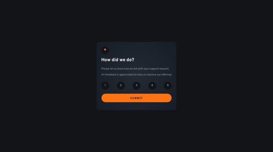
Interactive rating component (no libraries)


Design comparison

Solution retrospective
I am very satisfied with the markup and its simplicity, but I am sure I can leverage other solutions to refine it further.
I am happy for the time it took me to implement it because it matches my estimate.
What challenges did you encounter, and how did you overcome them?I questioned a little my choice of making the input radio visually hidden because I thought that I had lost keyboard access to it, but instead it was preserved.
I used axeDevTools to check that the rating values were indeed still accessible.
What specific areas of your project would you like help with?I would like to see how others implemented the radio buttons while maintaining full keyboard functionality.
Also, I would like to understand better why the colors I copy from the style guide file different from those that they appear in the Figma design. It's a bit annoying, but I am sure it is my ignorance in the usage of the tools. Please help :-)
Community feedback
- @hangtime319Posted 7 months ago
Congratulations!!!
I'm also unsure about the colors, but I try to manually correct the tone according to the design.
0

Please log in to post a comment
Log in with GitHubJoin our Discord community
Join thousands of Frontend Mentor community members taking the challenges, sharing resources, helping each other, and chatting about all things front-end!
Join our Discord