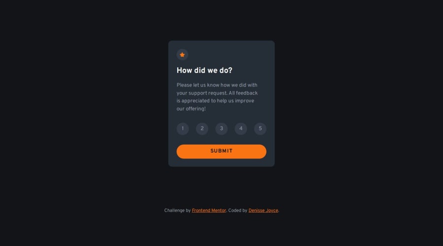
Interactive rating component main (SASS, VanillaJS)


Design comparison

Solution retrospective
Hi! RE: the number rating, is this the best practice (for accessibility) with the number buttons? Do you have better alternatives?
Thank you! Also any kind of feedback is welcome
Community feedback
- @mbank14Posted about 1 month ago
Hey, what you've done so far is great! I have a suggestion, though: maybe you could use radio buttons for selecting the rating number. I think it would be easier because we’d only need to focus on the active element. Right now, when I click on number 3, number 2 turns white, and when I press number 4, number 3 doesn't go back to its original color. You’d need to add some more conditions in the code for that
Marked as helpful0P@denissejoycePosted about 1 month ago@mbank14 hi there! Thank you for your feedback. The button to the left of the clicked button turning white was intentional (I'm realizing now I might have misread/misinterpreted the design, I thought it was supposed to turn white while the clicked button/rating turned orange).
In terms of accessibility, though, will using radio buttons be better than using
spans? I was toying around with both possible solutions but ended up usingspaninstead so I don't have to overwrite default radio button styles anymore 🤭0

Please log in to post a comment
Log in with GitHubJoin our Discord community
Join thousands of Frontend Mentor community members taking the challenges, sharing resources, helping each other, and chatting about all things front-end!
Join our Discord